Showing posts with label LETTERPRESS WEDDING STATIONERY. Show all posts

Sunday, April 28, 2013

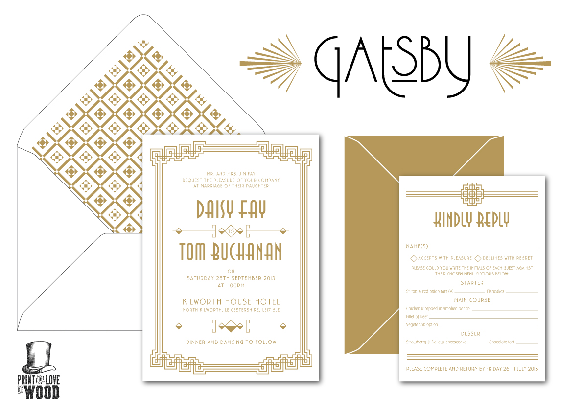
Gatsby Inspired Wedding Invites

All busy behind the scenes here at the studio, weddings, packaging and branding projects are taking over! Here's one that hopefully samples will be available sometime soon, love the gold and silver on charcoal, think some tests with bronzing powder are in order to give that little more glitz.
First though there are real wedding invites to design, finalise and print. Fully booked for the next few months and then I'll will be ready for some time off!

Wednesday, February 20, 2013

you've got mail...

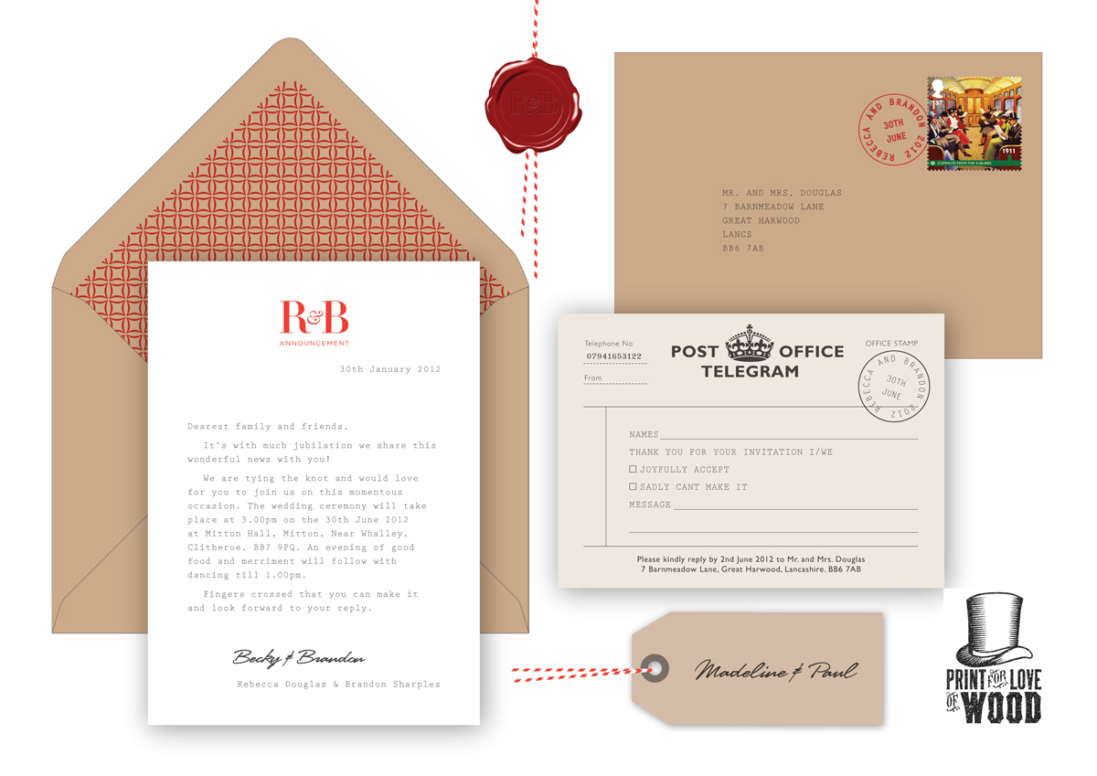
Yes mail of the analogue variety, a new design I'm working on for my affordable letterpress range of wedding stationery.
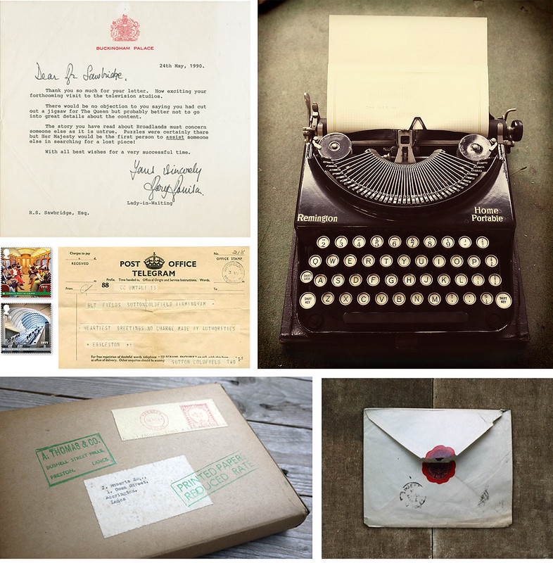
Inspired by a typed royal letter by Elizabeth II’s lady-in-waiting, a simple design that lends itself to letterpress beautifully. Vintage typewriter font deeply impressed into paper that takes you to analogue heaven. Here I've designed the letter as informal and friendly, the paragraphs indented. You could make it formal or have fun, or even personlise by writing each of the guest names. Par it with a vintage style telegram as a save the date or RSVP. Tactile kraft envelopes and vintage stamps finish off this nostalgic suite.
Has you seen the new Royal Mail London Underground stamps? I love the ‘Commute from the suburbs’, the image is from the Museum of Transports collection. A good tip is to keep an eye out for Royal Mail bringing out a new collection of stamps and buy them pronto to finish off your invite envelopes. Much more exciting than the standrad 1st class stamp. I love the box I found below, so plans are a foot to do a little postal box for the invite for the final samples. Just waiting for my new thick card stock to arrive and then I can get some samples printed, So many ways to customise this set, I could go on forever, as usual your comments would be much appreciated x
typewriter my new toy, a fabulous gift from a family friend / typed letter / London Underground stamps / telegram / wax seal envelope / found vintage postal box from my vintage ephemera collection

Sunday, October 21, 2012

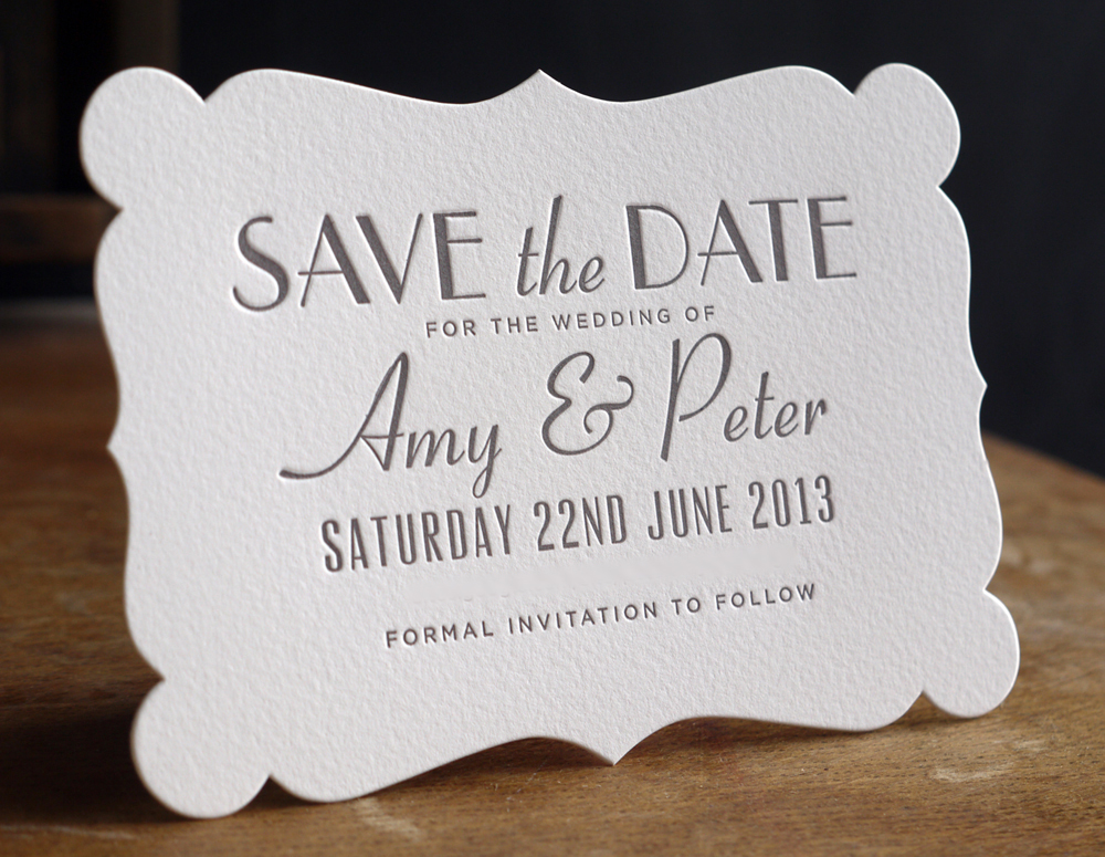
Astaire Wedding Save the Dates

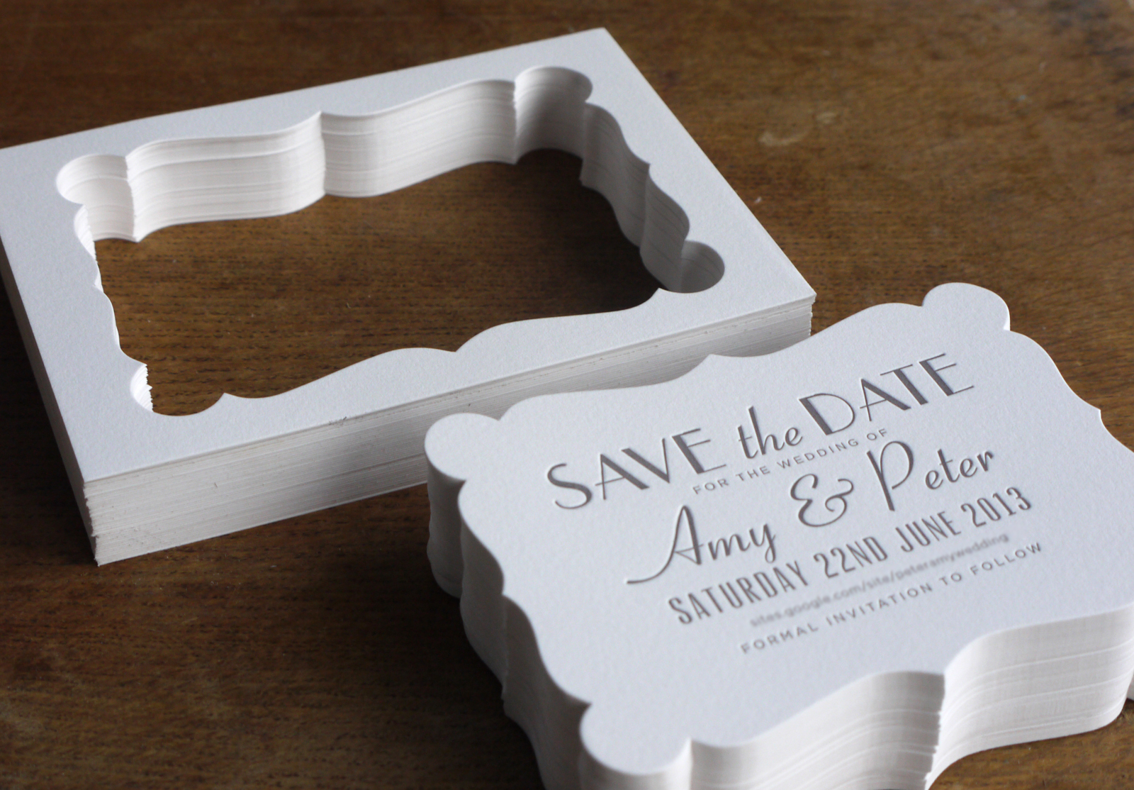
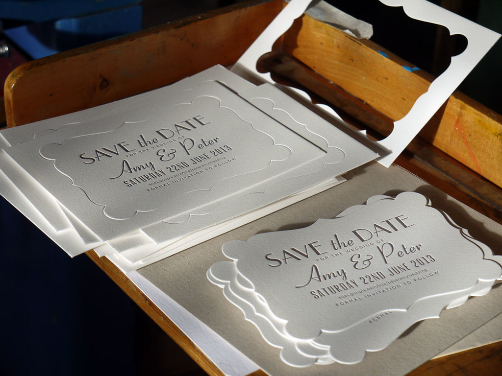
We are having a little Indian Summer and it feels more like Spring than Autumn! The sun is low and I love how it stretches it fingers of light through the many windows bringing a welcome warmth to the studio, after the cold weeks. Doesn't sun make you happy? Have to admit I danced around the studio to Smooth FM a little while I die cut these cards, should have donned on some leg warmers and played FlashDance mind you Fred & Ginger is more my pace these days :-)
Love how they have turned out! Seeing something I designed on screen finally being printed always gives me a big thrill, even the waste looks sculpturally beautiful, will have to find a use for those. A mat for a photo or if Amy & Peter have a seating plan maybe I can use one for each table? Any bright ideas someone?

Thursday, October 18, 2012

1930s Letterpress Wedding Invitations

Images source from my Pinterest board 1930s Wedding
I love delving into the past and researching for design. Amy and Peter asked to create their 1930s inspired wedding stationery, my brief was Fred & Ginger and champagne saucers. Plus Amy's grandmother had been a war bride and the only piece of stationery from her wedding was a letterpress card that was given with the cake similar to this.
The 1930s was a period of extremes from the great depression and World War II to the huge boom in radio and motion pictures. Going to the movies was an escape from life's daily struggles and for a brief moment you could escape into a glamorous and romantic world. In the black and white films they had to use lots of texture to create contrast so feathers, shiny silk and sparkles where found in abundance. In the early 30s white was a trend colour in fashion, interiors and if you were rich, a white car. This led to off-whites and soft pastels becoming popular, glamourise even more by the satin gowns worn by the Blond Bombshell.
Typography in the 1930s was still heavily influenced by Art Deco which can be seen in these fantastic movie stills here. It was amazing, with a bit of research, of how many fonts I held that were designed in this period or a modern interpretation such as Kaufman Script, MonoLine, Hardwood and Mona Lisa to name just a few. Geometric sans serifs influenced by the 1920s Bauhaus movement such as Kabel,  Futura and Gill Sans were introduced but not typical of the 30s.
Amy & Peter have kindly let me post about the progress so far. A selection of Save the Dates were designed and the final design is below. Simple, elegant and they are going to look amazing die cut and printed letterpress in pewter ink. Pictures coming soon!
Saturday, October 06, 2012

Wedding Fayre

The wedding season is in full swing so if your tying the knot why not pop in the Fletcher & Foley Wedding Fayre for a chat and a glass of fizz. I'm be there with my little press to talk about letterpress and invites, and you can print a little souvenir to take away for free. Plus Joanne from Fletcher and Foley has prepared some lovely goodie bags to give away!
Blooming gorgeous flowers from Fletcher & Foley
Sexy bespoke corsets, lingerie and clothing from Kiku
Coolest converted VW camper Ice Cream Dub
Yummy Cakes from Sugar Bun Sisters
Hope to see you there!

Saturday, September 29, 2012

to have and to hold

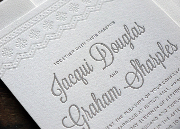
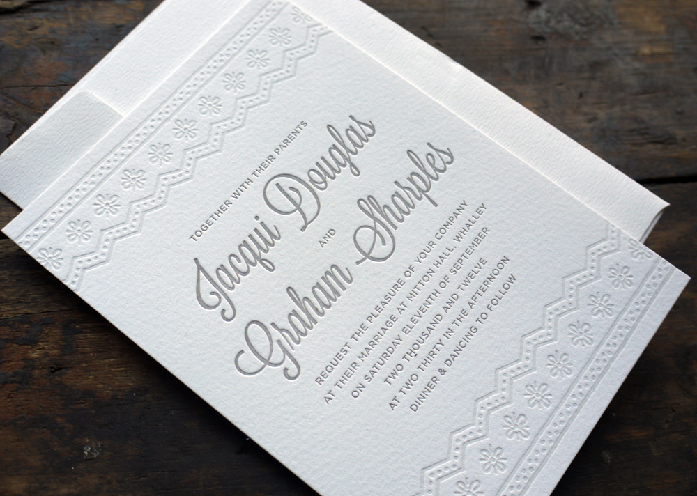
Remember the 50s wedding mood board here? Well I've printed some samples in pewter, the blind emboss on the lace I decide to do just a hint, helps the impression stand out. It involves just adding the tinniest amount of ink to transparent white and I love the effect. You could have a hint of blue, purple, pink, any colour to soften the mood! 
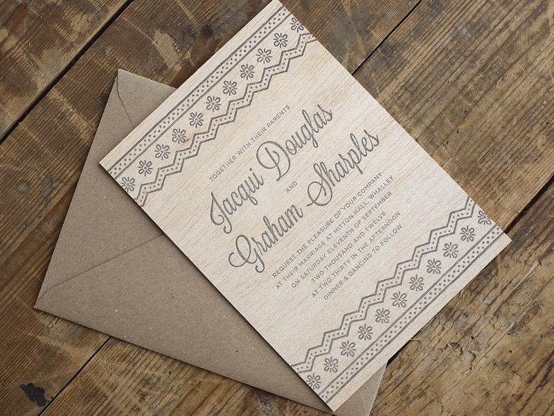
I'm working with several brides at the moment and one wondered if I could print on wood! So after some research and contacting local suppliers I found the perfect product to test on. The results are wonderful I love them! Ok I need to work on some more suitable designs but I'm crazy for their tactile quality. The impression doesn't photograph too well on the wood but it's there and I just can't stop running my fingers over them!
I love it, take one design, change the ink colour or the surface and you get three totally different moods. Which is your favourite?

Sunday, September 09, 2012

Wedding Inspiration English Garden

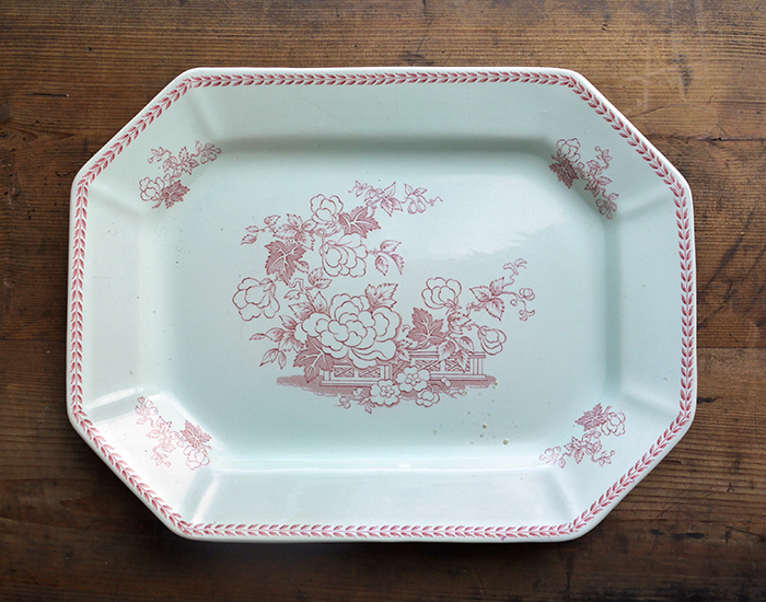
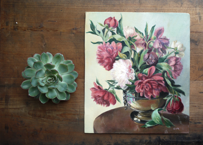
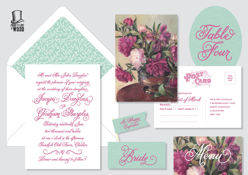
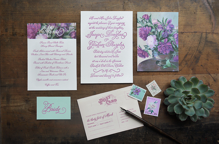
So as I mentioned on the last blog post there was a sudden change of plan for the photo shoot which had now changed to a Romantic English Garden. Helen from 7th Heaven had organised two gorgeous sample bridal dresses for the shoot and a bridesmaid dress in the fresh mint green. Inspiration for the colour scheme came from one of my favourite vintage plates and an old oil painting I found in a junk shop which was perfect for a vintage postcard. My new found friend and florist Joanne, aka Fletcher & Foley, had some fabulous old silver items for the flowers and we both love succulents, ok they are not an English garden flower but they add a nice modern twist to a vintage feel! Here my lovely new friends working on the shoot Foley Photography //  Fletcher & Foley // Ice-Cream Dub // Fudemental // 7th Heaven Bridal // Pouting in Peep Toes.

Sorry if I'm boring anyone with weddings but hey ho there's even more to come! I’m so lucky to have worked and be working with such lovely couples that make my job even more pleasurable. My only dilemma is what to name the wedding sets!

Wednesday, September 05, 2012

50s wedding mood board

TEA DRESS // PLATES // ICE CREAM DUB // FUDGE // CAKES // WEDDING SIGN // CATH KIDSTON FABRIC // FLOWERS
I'm so behind on my wedding blog posts, time for a catch up!
I had the fabulous opportunity of teaming up with some local wedding suppliers for a photo shoot, I've met some lovely people and new friends! The theme was to be a 50s inspired with lots of retro colours but due to unfortunate circumstance the theme had to change at the last minute but I thought I'd post it any way!
Here a list of the lovely folk I was working with Foley Photography //  Fletcher & Foley // Ice-Cream Dub // Fudemental // 7th Heaven Bridal // Pouting in Peep Toes. More to come on the final shoot later!
Here's the design I came up with...
Also thought this would look lovely with the pattern border in a blind impression, sweet and simple, must get some samples printed!
As usual I'd love to hear your comments...

Thursday, February 16, 2012

Sneak peek...

Sneak peek of a new letterpress wedding invite that I'm designing and printing. Has a lovely vintage RSVP postcard and kraft insert to match!

Saturday, September 17, 2011

thank you

New pictures added to the gallery on www.printforloveofwood.com
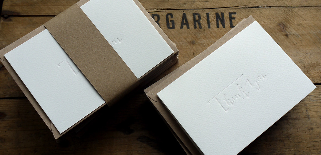
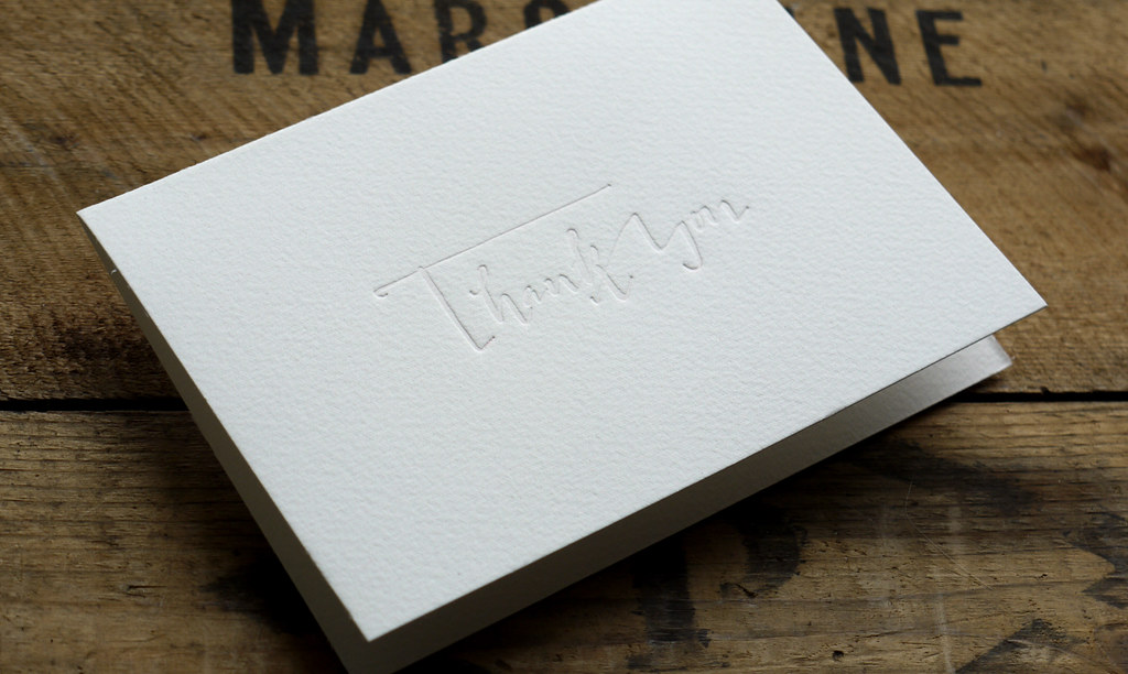
Wedding thank you cards for Amy printed on 300g Somerset cotton.
Very simple but very effective with a touch of transparent ink to give that extra dimension.

Friday, July 15, 2011

letterpress wedding invites

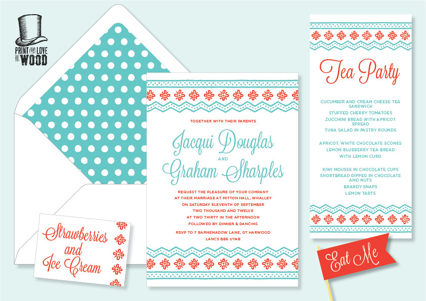
Work in progress, some designs for letterpress wedding invitations based on my love for vintage typography. I love how the use of bright colours on vintage type gives it a more contemporary look.
I have lots ideas too for more modern contemporary invites which I'll be working on soon!
I'll be offering a signature range of invitations that can be digitally or letterpress printed but what I love is bespoke design, something unique! If your interested in hiring me to design your invites for an upcoming event then contact jacqui[at]printforloveofwood.com.
Would love any feedback or your thought on wedding invites, do you think invitations are an important part of weddings?
Happy weekend!
Related Posts with Thumbnails