| IMAGES VIA NUDE INSPIRATION PINTEREST BOARD HERE
I was approached by the lovely Yorkshire lass Jo to design some packaging for her fabulous artisan soaps. So I just thought I would document the branding process to show how I finally came up with the design.
First of all I created a pinterest board with Jo, I LOVE pinterest for creating mood boards, emails and phone calls are fine but visual mood boards get you on the right track! If I pin Jo could like it or comment or pin something she liked. There was a lot of different styles from Art Nouveau, Art Deco to Indian inspired patterns but certain things became apparent to Jo and that was her love for geometric, symmetry and black and white. So first for inspiration I always turn to my huge hard backed The Grammar of Ornament by Owen Jones as its full of glorious plates showing the origins of patterns. I wouldn't bother with the small paper backed version but you can see the original plates here on the Digital Library for Decorative Arts.
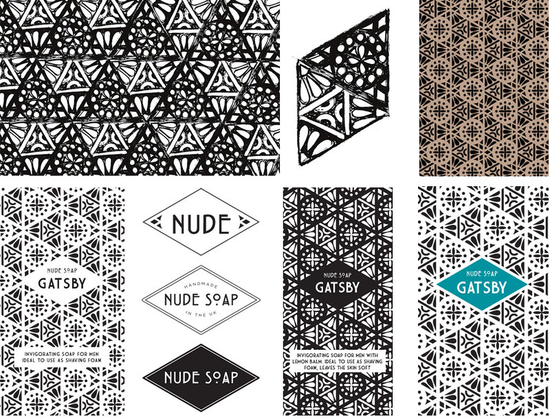
Fired up by began to doodle away but wasn't happy with anything until I searched through an old Art Nouveau pattern book and spotted a couple of unobtrusive triangles. They, to me, looked like a scientific equations but in pattern form, representing all the natural ingredients like plant extracts, oils etc that go into the making of soap. Taking the doodles I began to form the pattern, below are the initial concepts and scruffy doodles as I began to work with Jo on how we would take this to the next level and create her brand.
Stay tuned for the final reveal!
|
Showing posts with label DESIGN. Show all posts
Thursday, March 14, 2013
Creating an identity for Nude Soap
Sunday, July 22, 2012
Logo design
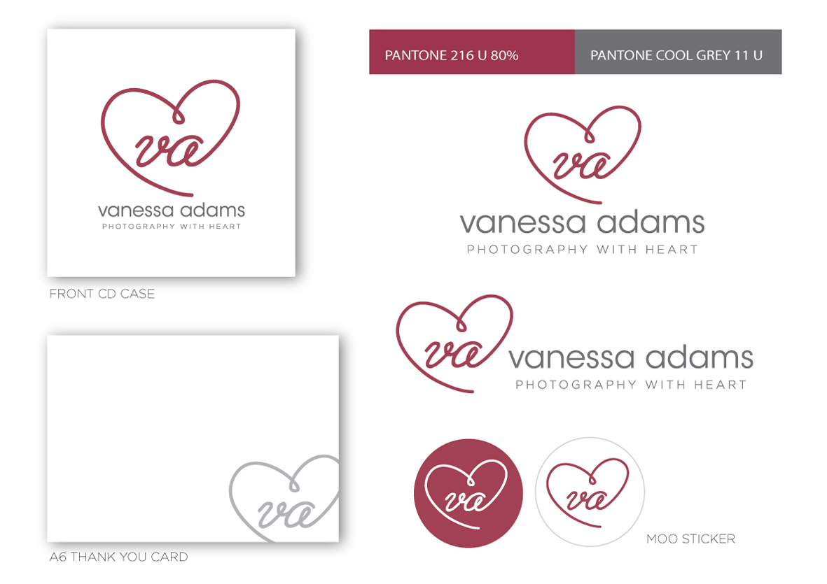
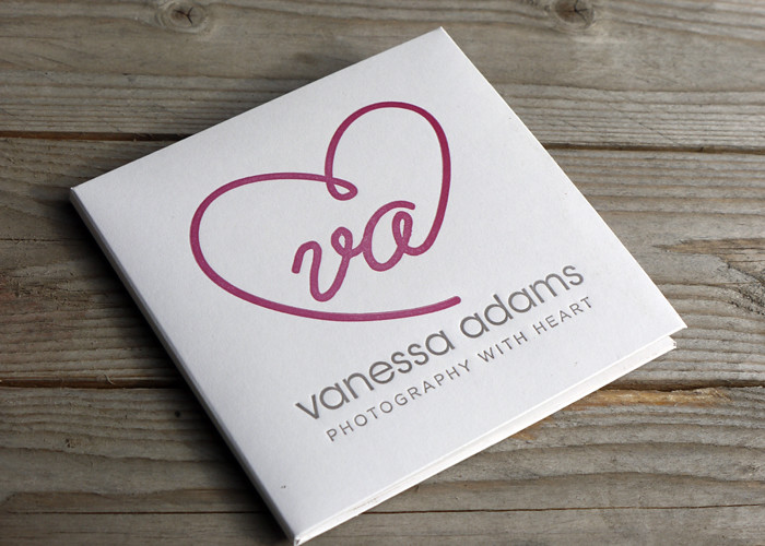
When Vanessa approached me to print her CD cases with her logo, it was crying out for a real identity! Many people are under the misconception that your name set in a typeface is a logo, when really a logo is an identifying symbol or mark that represents your brand. Vanessa is lovely and kindly trusted me with her re-brand. She wanted something simple and after reviewing her old blog and the way she shoots I came up with a new logo and a strapline. What's a strapline? In simple terms it's a short, catchy, easy to remember phrase that represents your brand. It should encapsulate everything about you that will in turn strike a chord with your target audience. Can be used in conjunction with your logo or on it's own. Simple!
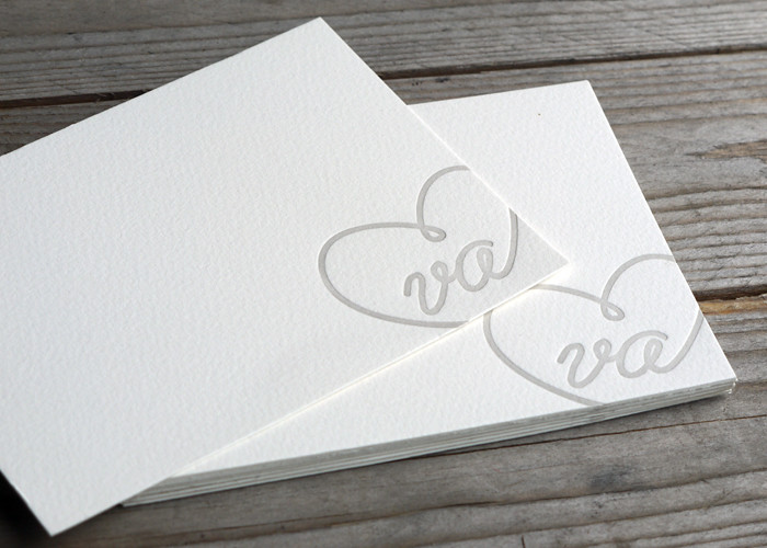
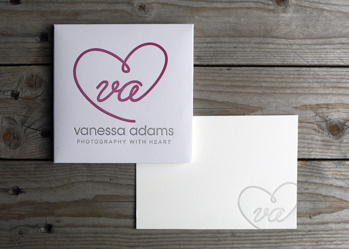
Above shows how adaptable the new design can be. The CD cases were printed letterpress with the website on the back and some thank you notes, which I love, in a paler version of the grey using just the logo bleeding off the edge. The logo worked perfectly for round MOO stickers to use on packaging, great way of getting your brand out there! As well as providing vector artwork for print, I also supplied Vanessa with web ready jpgs for her website and facebook cover plus a watermark brush for her photos. I think the black and white photographs work really well on website combined with the logo and Vanessa also got a logo guide with all the colour values converted for web, she has developed her site using just the two colours to keep her branding consistent.
Wow that's a long post for me! Hope you found it interesting? I just wanted to show that even on a budget a small business can look professional by getting their logo right at the first hurdle. As the company grows Vanessa can use the logo for other things, I think it would look fabulous as repeat pattern for her packaging, don't you? Her own branded tissue paper! Lovely!
Would also like to say a big thank you to Vanessa for visiting me at Saltair, she's so lovely and I think the design suits her to a T! Check out her website www.vaphotos.com.
UPDATE!
Check out Vanessa lovely pics sh took here on her blog, much better than mine ;) This is my favourite...
Wednesday, March 21, 2012
ALLOTMENT PROJECT
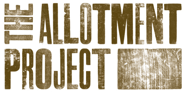
I recently had the pleasure of working with Source Creative to create a logo for Creativity Works Allotment Project. The logo had to form a block that represented an aerial view of an allotment and I had so much fun printing the textures from my very worn wood type, plus the grains from the back of the blocks were just as exciting! Some had saw marks which were perfect for the project. My favourite design was the top pic, I used a mixed font of 20 line condensed which to me represents the use of mismatched and recycled bits and bobs that go into building an allotment.
It's amazing how one job leads to another and now thanks to Cath and Source Creative, I will be also taking part in the project...
Letterpress Taster Workshop - Accrington Market Hall
Tuesday 27 March 11am-3pm
Only 12 places available so book quick! More information here www.artsmap.org.uk
Here's the final design created by Source which you read more about here
It's amazing how one job leads to another and now thanks to Cath and Source Creative, I will be also taking part in the project...
Letterpress Taster Workshop - Accrington Market Hall
Tuesday 27 March 11am-3pm
Only 12 places available so book quick! More information here www.artsmap.org.uk
Here's the final design created by Source which you read more about here
Tuesday, November 01, 2011
paper cut
Commissioned paper cut, not my usual sort of work but it's a long story, 50 x 50cm, all 248 words cut by hand!
A surprise first anniversary present representing all the things the couple did in their first year to form a circle symbolising eternity, no beginning and no end, it will continue to grow.
A lot of hard work but I was so please how it looked in the end, made even better by the lovely email from Amy...
“I couldn't believe it when I saw it, it's absolutely stunning! I can't imagine the time and effort it would've taken to put it together. Thanks so much.”
A surprise first anniversary present representing all the things the couple did in their first year to form a circle symbolising eternity, no beginning and no end, it will continue to grow.
A lot of hard work but I was so please how it looked in the end, made even better by the lovely email from Amy...
“I couldn't believe it when I saw it, it's absolutely stunning! I can't imagine the time and effort it would've taken to put it together. Thanks so much.”
A big thank you to Craig for trusting me with the design.
What a fabulous thoughtful gift, so romantic don't you think?
Tuesday, June 28, 2011
laugh at yourself...
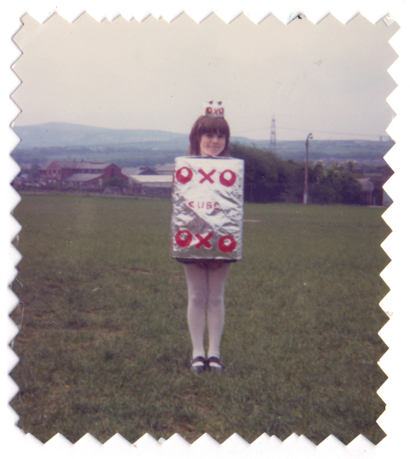
Oh yes I was introduced into advertising and graphic design from an early age, think I was about aged 8 in a Brownies fancy dress. Love how my mum had attacked the photo with pinking shears! I remember that day like it was yesterday, I was mortified at having to show my legs in white tights and wear that ridiculous hat ;D
Labels:
DESIGN
Tuesday, June 21, 2011
Art & Design Exhibition
Well I made it in one piece with just a few added grey hairs! After initial problems regarding fire regulations in the big glass atrium Studio51 came to the rescue printing our 2m x 1m on fire retardant boards so no cutting and sticking for BA3 Graphic Design students just a deadline brought forward by a week! Fantastic quality, I was so pleased how they all turned out especially the brick wall and wood type, want to bring them home! Had six boards mine are from the ‘One milliooo,ooon thanks' to the brick wall with a 20" x 30" letterpress printed poster.
The Art & Design Exhibition runs until Friday 24th June at UCBC with lots of fantastic work from design, textiles, fine art and photography students, so come along if you're local and show your support...
I'll be posting about some of my favourites from the exhibition next week so watch this space!
Labels:
DESIGN
Thursday, June 02, 2011
new designs
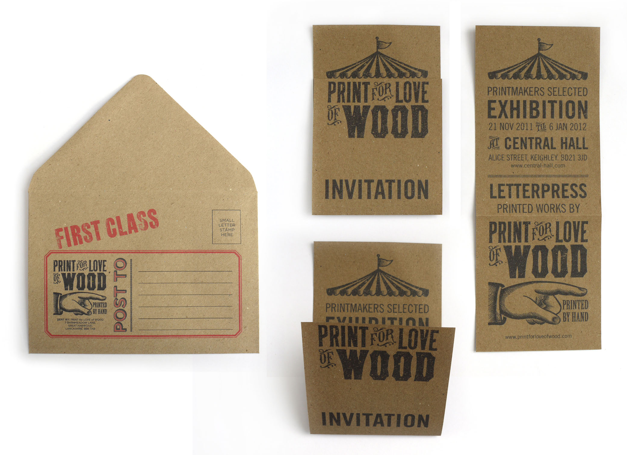
I've been working on new ideas using my new logos I showed you in this post the tent works well on a folded invite and couldn't resist an envelope to match. Think the receipts will be a nice touch to send with purchases. Also designed a couple more, the swatch tag for fabric printed products and a gallery.
Now for an email newsletter featuring the megaphone...
Labels:
DESIGN
Monday, May 30, 2011
Website design
Designing your own website comes with the joys of never being happy with what you've done! Now on my seventh attempt of mocking up in Photoshop, it's been simple, more vintage and now meeting in the middle! I've learnt a lot along the way, no point designing something that isn't possible to to achieve in CSS! The logos I designed (see earlier post) need to change top left for each section and I've also been designing other possibilities that I can incorporate the new logos, more to follow...
Going to leave it to simmer on the back burner for a while while I get on with some stationery designs.
Would love to know what you think, do you think it reflects my ethos and my business? And any coding wizz kids out there can you spot potential problems?
Labels:
DESIGN
Friday, May 20, 2011
new logos
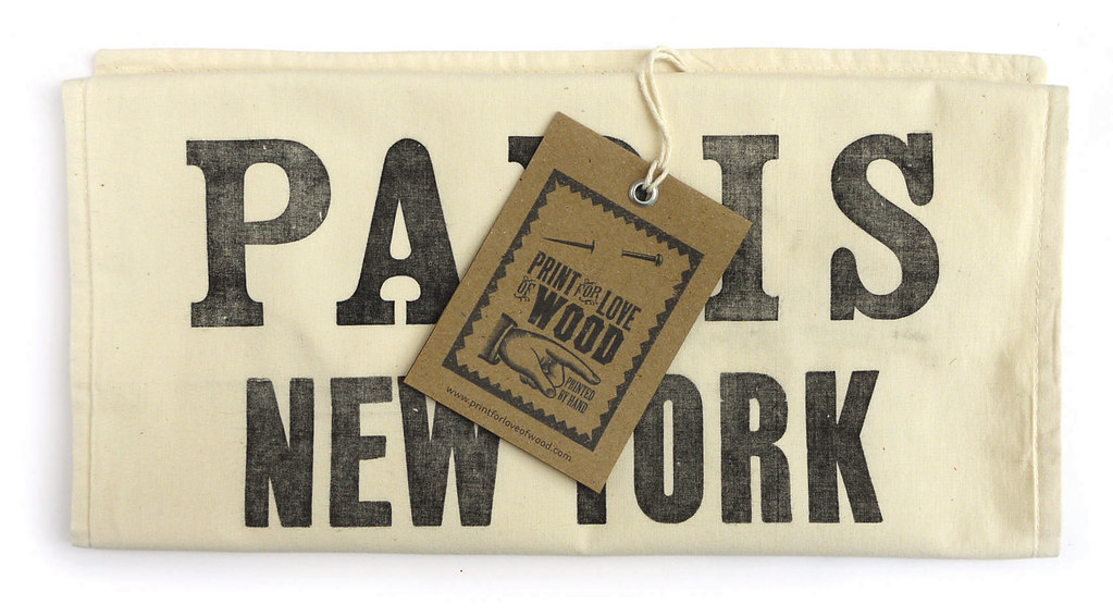
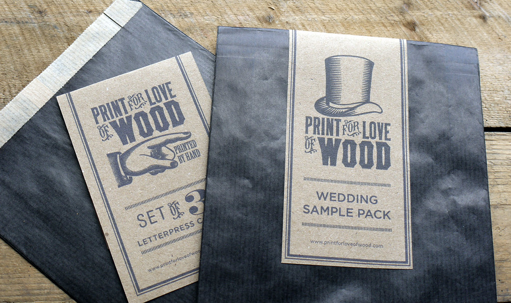
This is for part of my Final major Project at uni, logos for each section of a website, I've drawn then in illustrator then grunged them in Photoshop to resemble the original manicule (pointing hand ;o), the hat needs some more work as the lines too thick but it one of my faves, love the idea that it can be used on packaging too. I love the black coated brown paper bags so much I'm going to package sets of letterpress cards in them for the shop.
Weddings! Well it is an option I have been considering for a while and just never had the time to finish some designs I've been working on, hot foiling, die cutting got all the equipment just need more time, wish it grew on trees!
Better get back to designing a website, not an easy job when the logo has to change for each section will need help getting it up and running if the design goes ahead, coding makes my brain turn to mush ;D
What do you think and can you guess what the other 4 sections are?
Weddings! Well it is an option I have been considering for a while and just never had the time to finish some designs I've been working on, hot foiling, die cutting got all the equipment just need more time, wish it grew on trees!
Better get back to designing a website, not an easy job when the logo has to change for each section will need help getting it up and running if the design goes ahead, coding makes my brain turn to mush ;D
What do you think and can you guess what the other 4 sections are?
Labels:
DESIGN
Saturday, April 09, 2011
MPA Roses Creativity Awards 2011
The Brief: Younique - Great advertising & design connects with its audience. In six steps connect yourself with a hero. Present as a book and show us how unique your are.
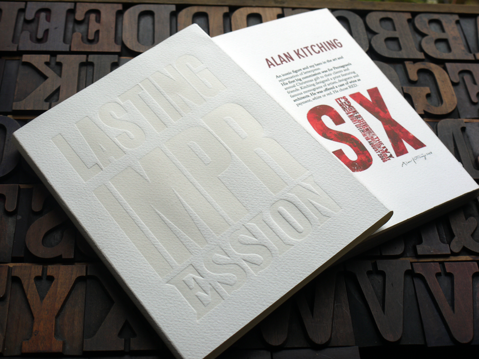
Good news! I received a Commendation for my book in the Roses Student Creativity Awards 2011. This has to be one of my favourite projects. The book is an accordion fold in which also the back links to the front. The slip case, transparent ink and wood type on dampened 300g Somerset, was not the easiest to produce but I do like a challenge.
Labels:
DESIGN
Friday, April 08, 2011
YCN Student Awards
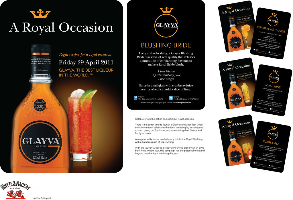
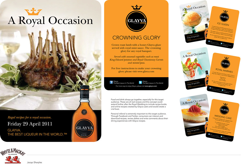
YCN BRIEF 2011 WHYTE & MACKAY,
Create a compelling campaign that resonates, builds awareness and encourages trial of Glayva among a new younger audience in the UK. Primary target audience – Males and Females aged 25-35, relatively affluent (ABC1).
My entry for the YCN student awards, lots of fun playing with words. I was amazed at how many real recipes I found with Glayva and of course I made the cocktails, had to do a tatse test ;D I also got the funniest looks from the guy behind the fish counter when I asked to photograph his fish!
Click the images if you care to have a read...
Labels:
DESIGN
Saturday, April 02, 2011
D&AD entry
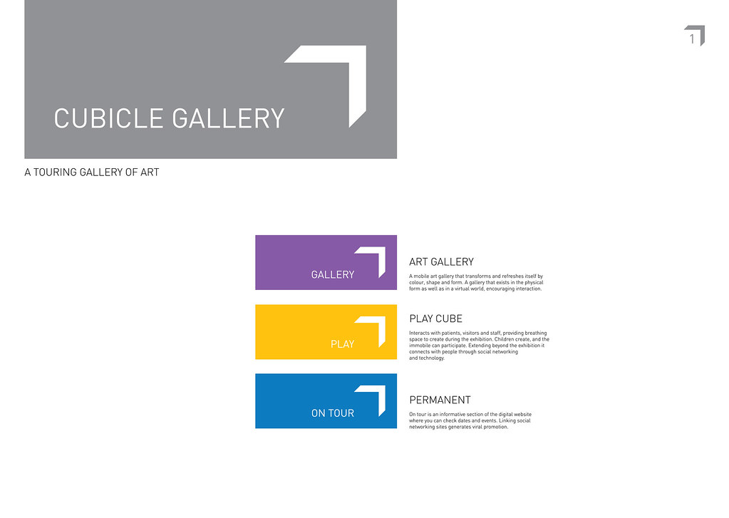
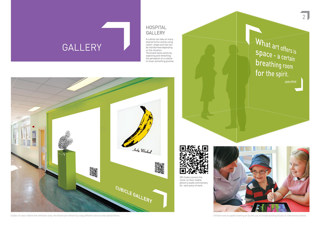
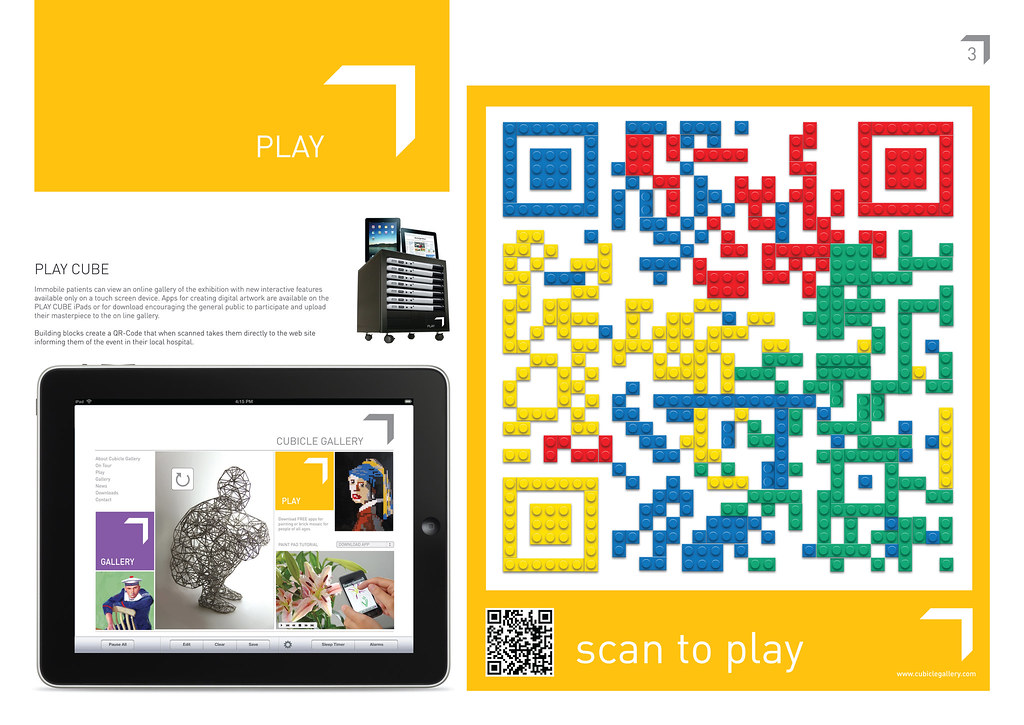
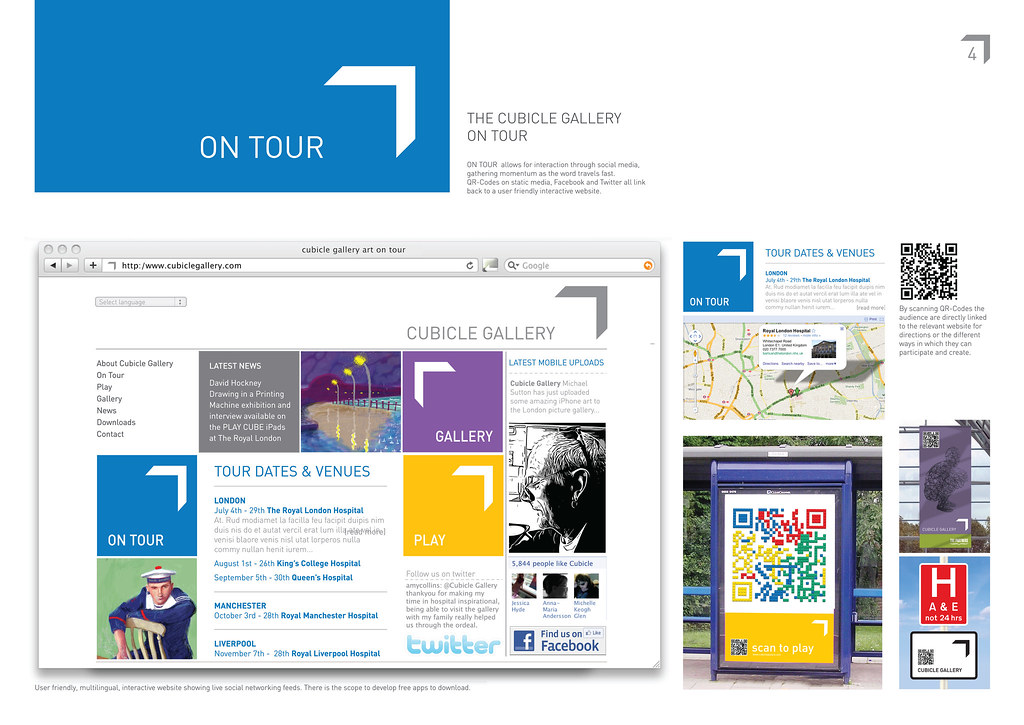
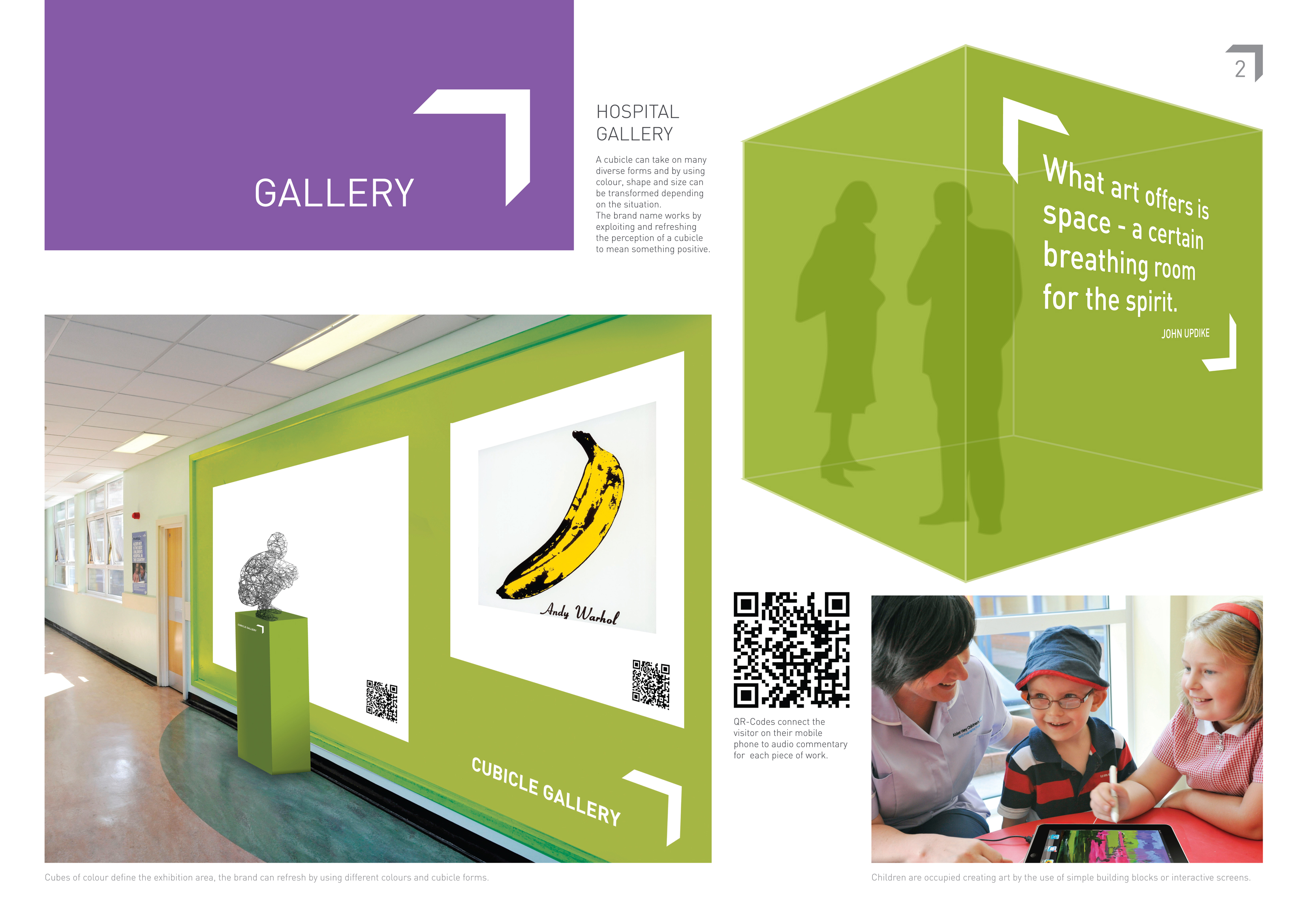
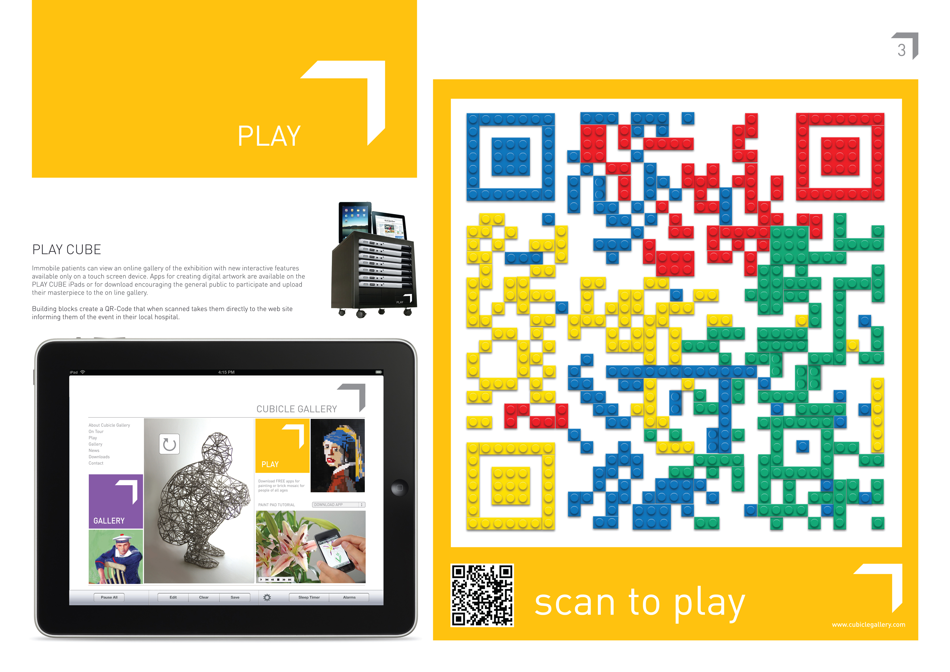
D&AD Students Awards Partners Brief. Create a name and brand for a touring art gallery that visits hospitals. Extend beyond the usual elements of a logo, typeface, tone of voice and colour palette.
The end of my degree approaches so things have been a little crazy, I've had 3 live briefs to complete and now it's my Final Major Project. So I'd thought I'd show you what I get up to when not printing letterpress. I really enjoyed creating a concept for this gallery, the name and logo went through many processes before I arrived at a simple result which I hope works on many levels. I was inspired by iphone art of David Hockney and as art to some can seem elitist I wanted the gallery to extend beyond the hospital to the mainstream by being interactive, who knows the next budding Picasso could be out there waiting to be discovered by the people. If you want a read click the pics for a large view.
I've been missing blog land but tried to keep up with all that you’re been up to, so many of you inspire me to keep going when I feel a little lost ;o) Good news, I manage to get my letterpress fix by teaching at Southport college this week, more about that when I can get some pics emailed. I was beginning to get withdrawal symptoms, it felt good to get covered in ink!
Have a lovely weekend all, I'm wishing for some rays of sunshine so I can enjoy some fresh air with my poor neglected family...
Labels:
DESIGN
Sunday, January 23, 2011
work in progress
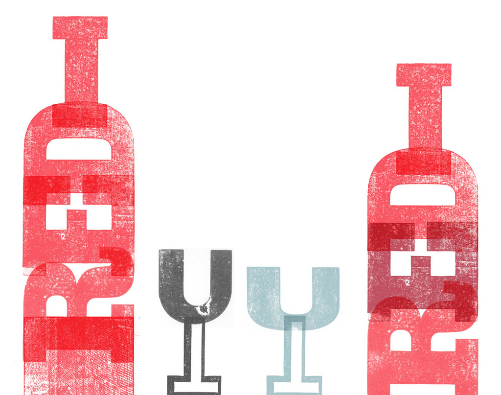
An idea I'm playing with for a book project for uni in which red wine and wood type are part of the text.
Can't decide which bottle I prefer... any thoughts?
Red wine is a favourite of mine for the weekend, especially if accompanied by a lovely meal ;) Hope everyone is having a lovely weekend!
Labels:
DESIGN
Thursday, September 16, 2010
things {we} make

Claire over at things {we} make very kindly asked me to design a new banner for her blog, the design also needed to be able to fit as a block and be adapted to things {you} make, a new project coming soon, showcasing things people make.
Most important it had to be in letterpress wood type! How could I refuse ;D
Over at things {we} make not only do they grow, cook and make things, Claire take beautiful pictures and check out Eds beautiful wood furniture, my five year old would wreak havoc with that catapult ;D.
If you like cooking and growing your own or make things yourself, go and check out their blog and join in!
How yummy does that brown sugar and yoghurt cake look!
Labels:
DESIGN
Monday, August 16, 2010
Friday, June 04, 2010
Soapure
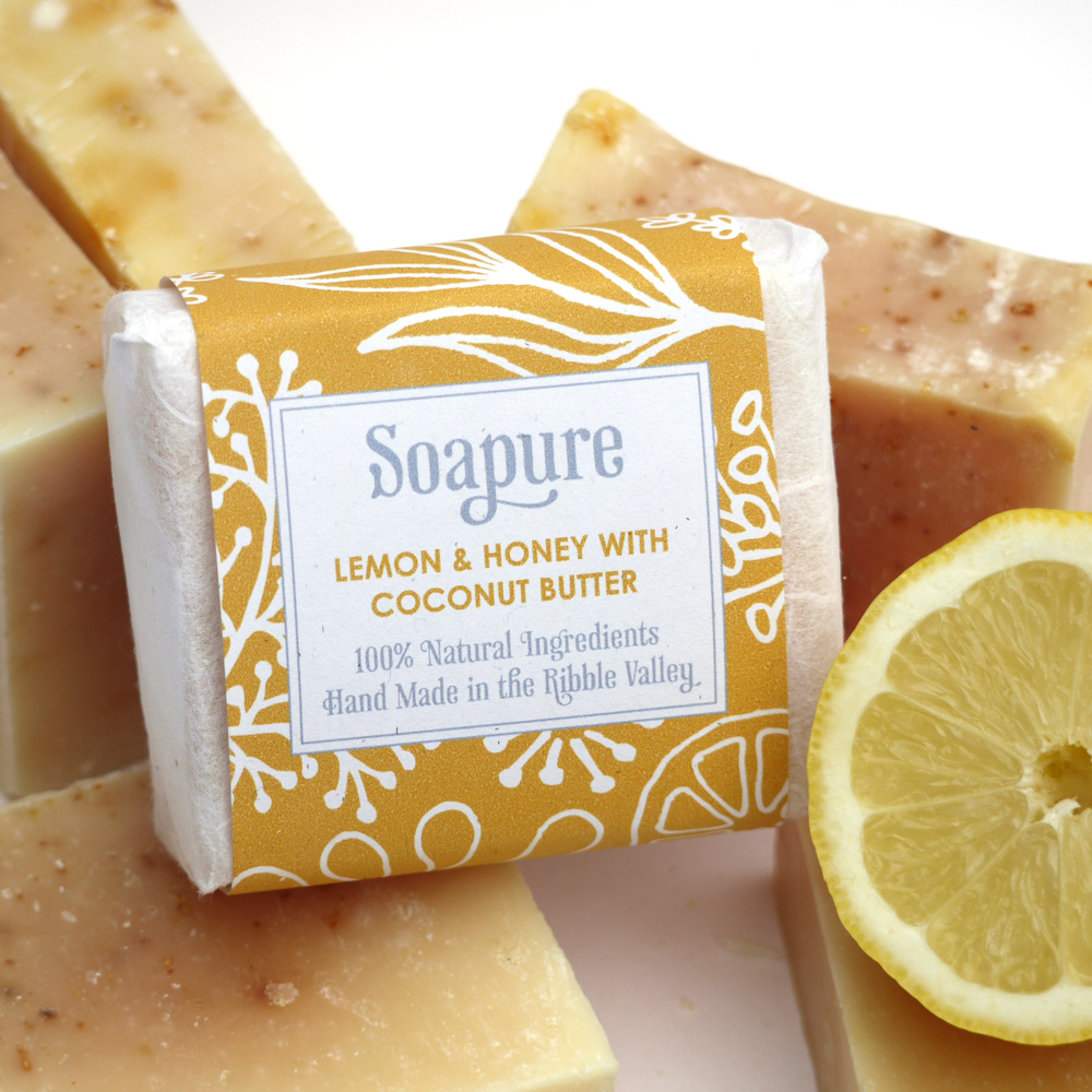
I mentioned some soap packaging I was designing in a post here well I won the pitch and I've finished the first range and also took all the photos for the website, pretty please with myself as to how they turned out, here are just a few...
No fancy lighting, no studio, just my north facing front garden (northern light's the best for pics), a chair and a big sheet of white paper. There are lots of tips on taking your product shots on the net but here are a few from Haptree that are well written and will have you taking better pics in no time... Photography tips also also here on the Folksy blog. I use this method Using natural light when I can't get outside because of the weather!
I'm pleased to say Soapure has now opened a Folksy shop and you can view more of her lovely products here, they are divine and smell good enough to eat, the body butter is great for your feet too ;o
Labels:
DESIGN
Wednesday, May 05, 2010
Packaging design
Not to much playtime (printing) at the moment only several weeks left at uni so lots of essay writing going on, but I do love making things, so I really enjoyed the packaging brief for a brand extension.
I did manage to integrate some letterpress with wood type that I printed and scanned, lucky for me I had wood type that was a near enough match to the logo.Came up with a solution for making it look like a real foil by printing on SAFMAT which I then stuck onto tinfoil, looks pretty realistic I thought, fiddly little suckers to make but fun :) All those years watching Blue Peter do come in useful!
Hard to photograph foil and I'm not happy with the pics, think I'll try taking them again!
Can't wait for the end of my second year then I can get some serious printing done, lots of ideas, role on June :)
Labels:
DESIGN
Friday, March 26, 2010
Soap Packaging
One of my favourite live briefs on my design course this year, to design packaging for a local company selling handmade soap SOAPURE, this is part of my business studies and the winning design will get some prize money! So wish me luck :)
The packaging had to be design so it could be cost effective and printed from a home computer so I couldn't go crazy and make it too complicated, this is an extract from my design report (which I hate writing :)
My favourite is the large pillow box for wrapping, which do you like best or maybe you think it's not posh enough...
1. Soap gift box, 2. Soap Lavender, 3. Soap tags, 4. Soap Pillow Box, 5. Soap Lemon, 6. Soap Pink Clay
The packaging had to be design so it could be cost effective and printed from a home computer so I couldn't go crazy and make it too complicated, this is an extract from my design report (which I hate writing :)
A brand identity has been created that not only reflects the quality hand made products and natural ingredients but will provide uniformity from the packaging through to the website.
Inspired by the organic patterns of William Morris, hand rendered illustrations of the ingredients used throughout the range create an organic pattern. A hand drawn typeface was chosen to compliment the freshness and natural ingredients. The hand rendered elements not only reflect the natural ingredients but evoke the hand made aspects and provide a unique identity and through the simple change of a background colour each product can be easily identified.All the materials used are eco friendly and sourced locally, the typeface is the lovely organic Phaeton, I love making things especially when it's for a fellow crafter ;)
My favourite is the large pillow box for wrapping, which do you like best or maybe you think it's not posh enough...
1. Soap gift box, 2. Soap Lavender, 3. Soap tags, 4. Soap Pillow Box, 5. Soap Lemon, 6. Soap Pink Clay
Labels:
DESIGN
Subscribe to:
Posts (Atom)