Showing posts with label PACKAGING. Show all posts

Thursday, January 29, 2015

catch up

Neglected blog! Catching up, these little birds flew off to Australia...
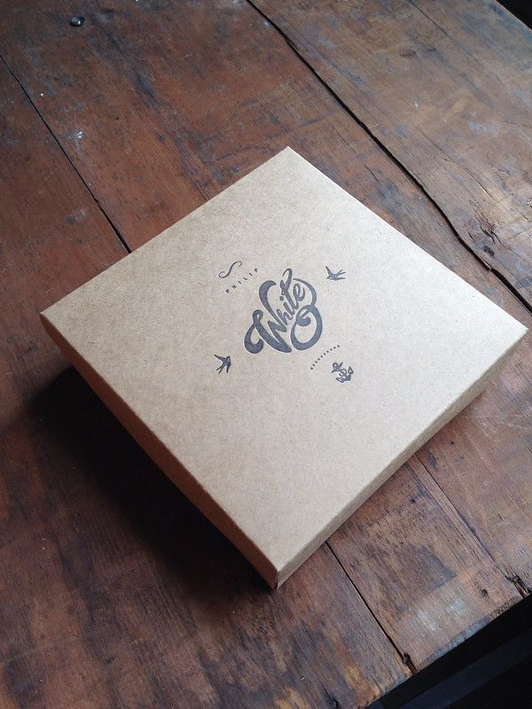
DVD sleeves and boxes for www.philipwhiteweddings.co.uk
so please how these turned out for ww.reel-weddings.com
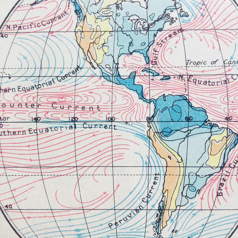
charity shop finds... just love these graphics in a vintage geography book

CD sleeves for Paula Beaumont Photography

Thanks to the lovely Paula for sending me these fabulous images of her finished packaging. Single self locking kraft CD/DVD sleeves printed letterpress in dark brown ink,  also printed some custom vintage camera tags to match!

Photographs by www.paulabeaumontphotography.co.uk

Thursday, May 22, 2014

a chip off the old block


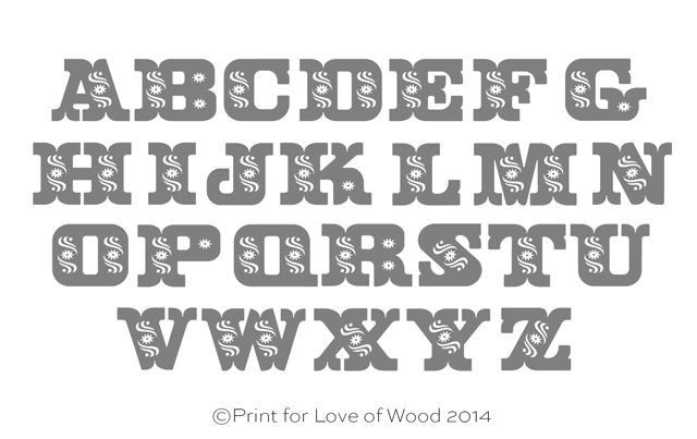
If you follow me on instagram, facebook or twitter you'll have seen the process of my new Tuscan Blocks. I’ve had an old book of alphabets for years and loved the page on Decorative Tuscan so months of redrawing it on thew mac, leaving it to one side for a while, I finally got round to finishing the whole alphabet plus added an ampersand. I wanted to do something a little different than printing and work with another small business, so I enlisted the help of Mark at Laser Wood Type.
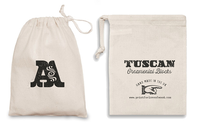
Letterpress cotton bags so ready for gifting and to launch the blocks who can't resist a letterpress pun!
Watch this space for more Tuscan delights!
Available in my SHOP and on , ETSY  |  FOLKSY 

Tuesday, March 25, 2014

notes jewellery packaging

Photography by www.yeshenvenema.com

Letterpress pillow boxes and wrap around for the lovely Emma at Notes Jewellery.
Printed letterpress on a off white board with a distinctive tactile feel and fibrous inclusions to give organic appearance and feel. I love the personalised tree pendants! To see more of Emma’s unique jewellery visit www.notesjewellery.co.uk
Beautiful product photography by the talented Yeshen, check out his work here

Thursday, March 20, 2014


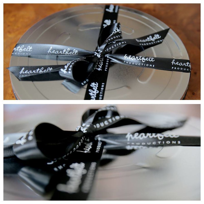
I'm getting more and more orders for film packaging these days, I printed these double felt white sleeves and flat note cards for Hazel at Heartfelt Productions. who packaged everything in a film can and tied with branded ribbon.
Bespoke printed ribbon and stickers are a great way to enhance packaging and carry your brand all the way through your packaging. I love how all my lovely customers add their own personal touch to the CD or DVD sleeves I print, and I'm pretty sure the happy couple love them too!

Wednesday, March 19, 2014

sweet surprise

Photographs by Jennifer Peel www.jennifertakesphotos.co.uk

Thanks to Leanne at Blooming Lovely Films for sending me these fabulous photos of her finished packaging. I printed the essentials like the DVD sleeves, business cards and boxes, also the design for the disks and a custom rubber stamp . You can see from my photos here in a recent blog post, what a difference it makes when it's all comes together and you add your own personal touch, branded love hearts what a sweet touch!

Saturday, January 04, 2014

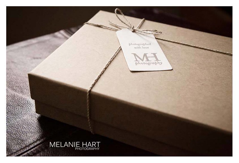
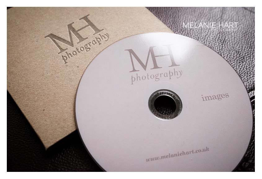
New logo and letterpress packaging

Melanie, a local photographer, visited the studio to discuss a new logo and packaging. She felt her old logo was too masculine and wanted something softer (you can see the old logo on the black sticker in the box). I gave her logo a much softer look without being too girlie. Letterpress branded kraft CD sleeves and tags all printed in warm grey complete the look. Just shows with a little thought you can get the professional look for your packaging without a huge budget. Thanks Mel for the fabulous pics and supporting local business!
More lovely pics of the finished look on Melanie's Facebook Page.
www.melaniehart.co.uk

Monday, July 15, 2013

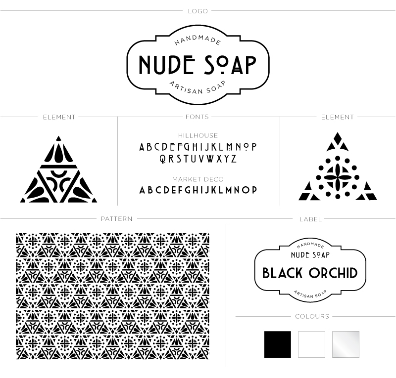
Identity for Nude Soap

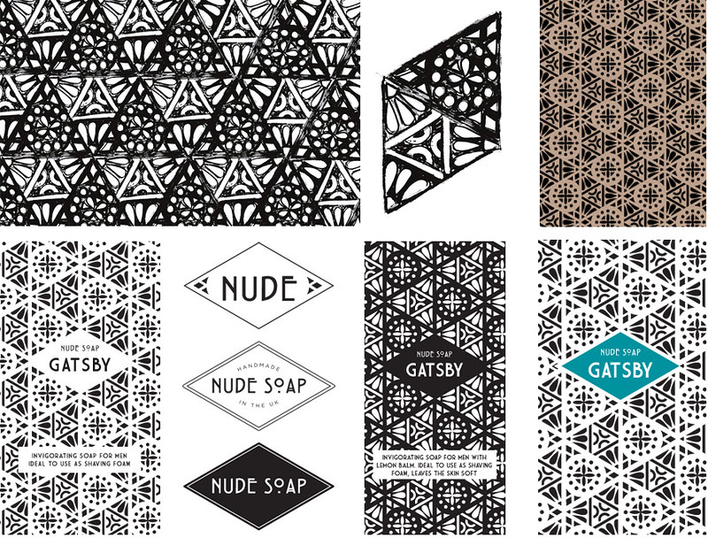
A while back I went through my process of creating an identity for Nude Soap (if you missed it you can see it here) Jo wanted the end result to be clean and mono tone with the pattern and product name taking centre stage. As her range of products grows, elements from the pattern can be used to create packaging like clear labels for bottles etc. Or I think triangular tags tied with black and white twine would look fabulous as gift tags! To kick start I developed a packaging wrap that had to take into consideration that not all of Nude soaps are the same size hence the horizontal wrap that's fastened at the back with the all important ingredients sticker, I love the black glassine paper used to wrap the individual soaps. There's also the fact I have to have samples to design packaging in the first place, means I smell lovely! Thanks Joanne for being such a joy to work with and I'll keep you all posted to when her site is up and running.

Saturday, June 22, 2013

Just the ticket...

letterpress packaging
box
Letterpress business card vintage-trimmer
It's been a mad couple of months, finally catching up taking pics of what I've been up to... First is the lovely Leanne who came to me wanting some packaging for Blooming Lovely Films. I had an idea for business cards which we both loved, remember the vintage trimmer above, well finally it came in handy, turned out to be just the ticket! (sorry, couldn't resist ;)
Grab some popcorn and pay a visit to
Some feedback from Leanne about her cards
“Oh my god I love them! The business cards are the muts nuts! Thank you SO much jax you're a star! Xx”
Leanne you make me laugh :D Made me remember a long time ago I design some self promotion in the form of a bottle of red, you can see it HERE if you want a giggle, one day I might draw a better pair of grapes ;-)

Wednesday, May 22, 2013

jewellery boxes

I printed these boxes for my lovely friend Nikki, the little one is so super cute! They are going to look beautiful finished off with her new grey washi tape, twine and spotty tissue.
What will be inside?
Some gorgeous creations like below plus much more in the Maneggi Etsy shop
Logo designed by Nikki’s partner

Monday, May 13, 2013

new white felt cases

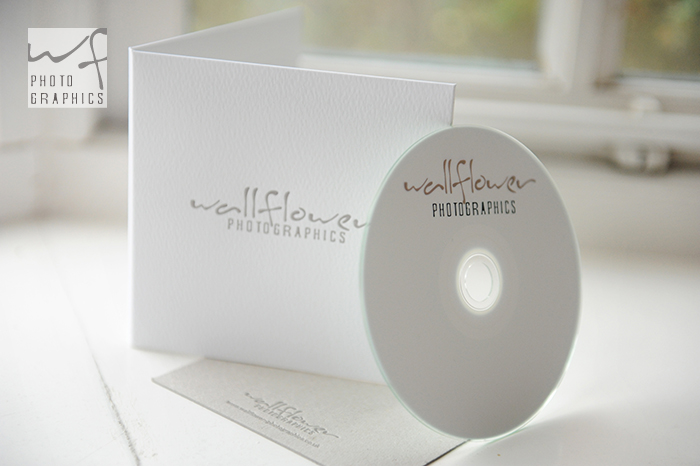
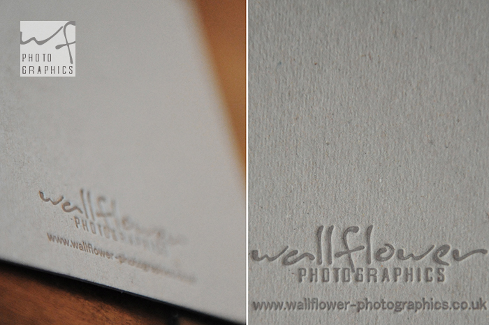
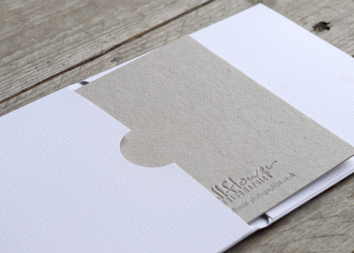
New textured natural white CD sleeves and 1mm thick grey note cards printed letterpress one colour, slate grey. We used grey board which takes a wonderful impression and contrasts nicely when inside the case. Rachel kindly posted these lovely images on her blog and sent me a lovely message! Thanks Rachel x
They've arrived!!!! And we love them!!! Massive thank you, we'll be using you again and again!! xxx

Sunday, May 12, 2013

sea shells

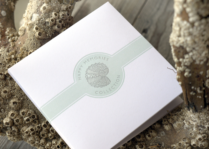
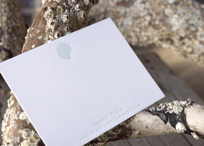
Double CD sleeves printed printed for Oksana in Switzerland, with a wash of what I call sea spray then over printed in warm grey. Note cards printed in a hint of sea spray, Why just a hint? Well it highlights the impression into soft cotton paper, a blind impression (no ink) would have looked a little lost! Thanks Oksana for trusting my judgement the colour x

Wednesday, May 08, 2013

sweet!

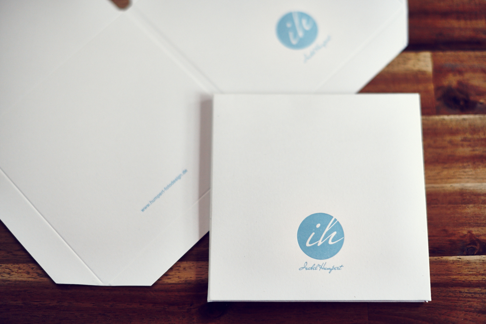
Isabel sent me some beautiful images of her letterpress CD sleeves I printed for her. From the unwrapping of my parcel to the finishing touches above. Isabel’s from Frankfurt but photographs worldwide, I love the her image above, fabulous capture that makes me smile! You can see more of her  fabulous work on her website www.humpert-fotodesign.de
And how sweet is this! Isabel sent a thank you of chocolates in the post. A bad excuse I know but I ate them all before I could take a better picture ;) How could I resist! Thank you lovely Isabel, they were delicious and made me smile xxx

Thursday, March 14, 2013

Creating an identity for Nude Soap

IMAGES VIA NUDE INSPIRATION PINTEREST BOARD HERE


I was approached by the lovely Yorkshire lass Jo to design some packaging for her fabulous artisan soaps. So I just thought I would document the branding process to show how I finally came up with the design.

First of all I created a pinterest board with Jo, I LOVE pinterest for creating mood boards, emails and phone calls are fine but visual mood boards get you on the right track! If I pin Jo could like it or comment or pin something she liked. There was a lot of different styles from Art Nouveau, Art Deco to Indian inspired patterns but certain things became apparent to Jo and that was her love for geometric, symmetry and black and white. So first for inspiration I always turn to my huge hard backed The Grammar of Ornament by Owen Jones as its full of glorious plates showing the origins of patterns. I wouldn't bother with the small paper backed version but you can see the original plates here on the Digital Library for Decorative Arts.
Fired up by began to doodle away but wasn't happy with anything until I searched through an old Art Nouveau pattern book and spotted a couple of unobtrusive triangles. They, to me, looked like a scientific equations but in pattern form, representing all the natural ingredients like plant extracts, oils etc that go into the making of soap. Taking the doodles I began to form the pattern, below are the initial concepts and scruffy doodles as I began to work with Jo on how we would take this to the next level and create her brand.
Stay tuned for the final reveal!

Tuesday, June 26, 2012

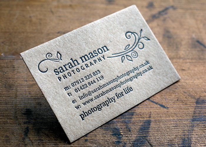
Kraft CD cases and businesses cards

Photo by Sarah Mason
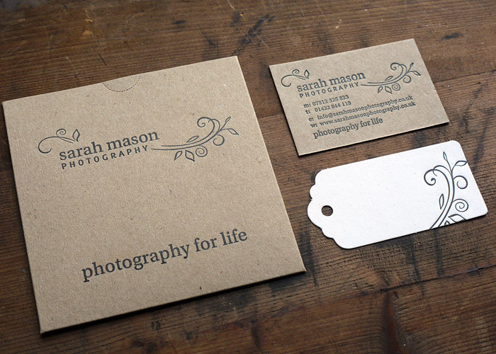
I had the pleasure of working with the talented Sarah Mason who was re-branding. With her website designed Sarah wanted some CD cases and stationery to match. The business cards were printed on 500 micron kraft which is a nice firm board and takes impression well. Sarah also wanted a tag so I suggested using elements of her logo which we printed on a 320g recycled flecked off white to compliment the kraft. She also came to photograph the press in action, I go off in my own world when printing so it was a little weird at first but Sarah soon put me at ease and we did laugh at her attempts to treadle!
You can see more images here on Sarah's blog, how lovely to see them photographed in natural surroundings. I love the tags swinging from the tree and how fabulous do the rest look on tree branches and amongst blue bells!
www.sarahmasonphotography.co.uk
Related Posts with Thumbnails