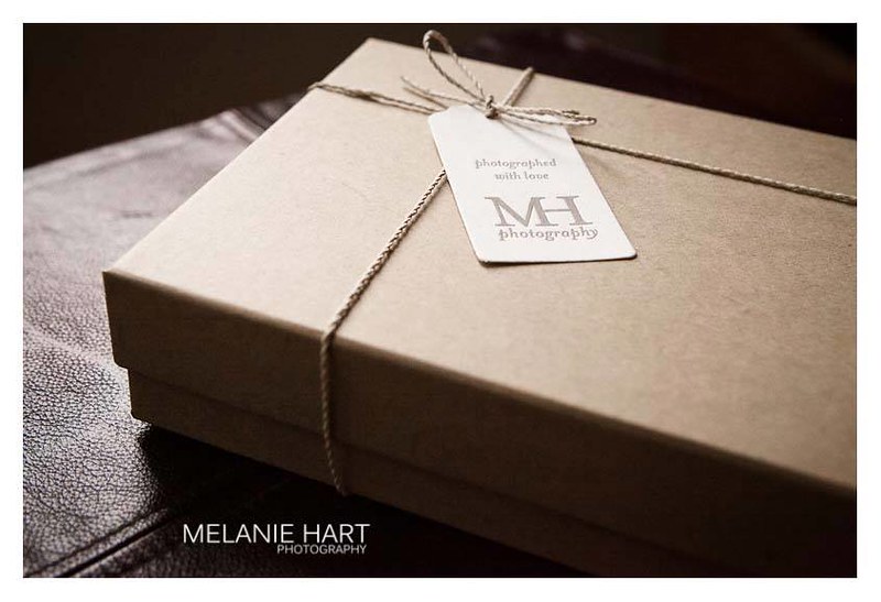

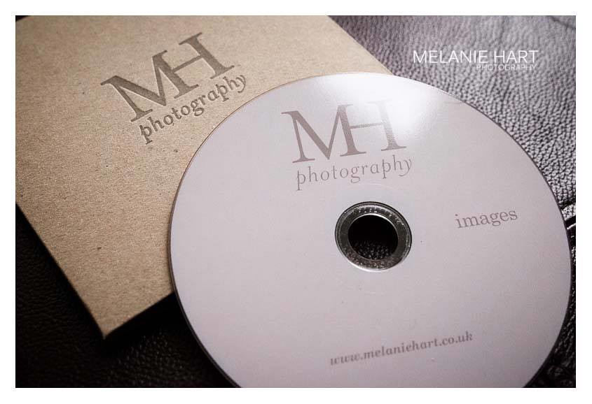
Melanie, a local photographer, visited the studio to discuss a new logo and packaging. She felt her old logo was too masculine and wanted something softer (you can see the old logo on the black sticker in the box). I gave her logo a much softer look without being too girlie. Letterpress branded kraft CD sleeves and tags all printed in warm grey complete the look. Just shows with a little thought you can get the professional look for your packaging without a huge budget. Thanks Mel for the fabulous pics and supporting local business!
More lovely pics of the finished look on Melanie's Facebook Page.
www.melaniehart.co.uk
Love, love, love!
ReplyDeleteJacqui, a great job as usual! You know we're fans at Lyme Bay Press :)
ReplyDeleteCheers Peter! Couldn't have done it with out you lovely lot! ;)
DeleteJacqui, another lovely job. You know we're fans at Lyme Bay Press :)
ReplyDelete