Showing posts with label BRANDING. Show all posts

Saturday, March 22, 2014

I've been doing a little volunteer design work behind the scenes at Churchfield House, an historic building left to the people of Great Harwood. An army of volunteers (including my parents) formed the Churchfield Trust and are working extremely hard to bring this building into the 21st century and to keep the legacy for future generations. You can read all about the history via the website and a recent article in Lancashire Life magazine where my dad gets a little mention in the “Jack's job list”. Darn it that's my ‘Dad’s to do list‘ put on the back burner for a while! What would you do without your dad eh!
I love Historic buildings and have seen too many during my 48 years fall into decay and feel its so important that the next generation gets stuck in to help in any way they can. With so many people feeling the squeeze during the recession Churchfield House we feel is the perfect venue for a small wedding or function, the rooms are beauiful and there's such a welcoming ambiance that makes you feel so at home. Vintage weddings are so on trend so perfect for the DIY bride too, Downton Abbey on a small scale I'd say. Who wouldn't like to feel like Lady Mary for a day!
I've been working on the branding and given the logo a more contemporary look, signs and leaflets are being printed so things are coming together. I've some some internal signage to do which will be done letterpress so will be glad to use my new wood type. Plus something for the World War I exhibition which will be lovely to do!

If you live close you can follow events via facebook and twitter and their website
www.churchfieldhouse.org

Saturday, January 04, 2014

New logo and letterpress packaging

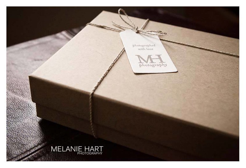
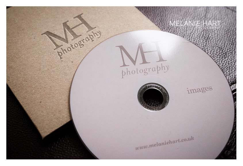
Melanie, a local photographer, visited the studio to discuss a new logo and packaging. She felt her old logo was too masculine and wanted something softer (you can see the old logo on the black sticker in the box). I gave her logo a much softer look without being too girlie. Letterpress branded kraft CD sleeves and tags all printed in warm grey complete the look. Just shows with a little thought you can get the professional look for your packaging without a huge budget. Thanks Mel for the fabulous pics and supporting local business!
More lovely pics of the finished look on Melanie's Facebook Page.
www.melaniehart.co.uk

Monday, July 15, 2013

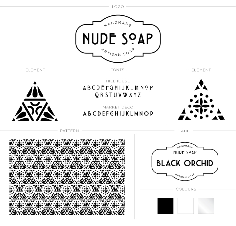
Identity for Nude Soap

A while back I went through my process of creating an identity for Nude Soap (if you missed it you can see it here) Jo wanted the end result to be clean and mono tone with the pattern and product name taking centre stage. As her range of products grows, elements from the pattern can be used to create packaging like clear labels for bottles etc. Or I think triangular tags tied with black and white twine would look fabulous as gift tags! To kick start I developed a packaging wrap that had to take into consideration that not all of Nude soaps are the same size hence the horizontal wrap that's fastened at the back with the all important ingredients sticker, I love the black glassine paper used to wrap the individual soaps. There's also the fact I have to have samples to design packaging in the first place, means I smell lovely! Thanks Joanne for being such a joy to work with and I'll keep you all posted to when her site is up and running.

Thursday, March 14, 2013

Creating an identity for Nude Soap

IMAGES VIA NUDE INSPIRATION PINTEREST BOARD HERE


I was approached by the lovely Yorkshire lass Jo to design some packaging for her fabulous artisan soaps. So I just thought I would document the branding process to show how I finally came up with the design.

First of all I created a pinterest board with Jo, I LOVE pinterest for creating mood boards, emails and phone calls are fine but visual mood boards get you on the right track! If I pin Jo could like it or comment or pin something she liked. There was a lot of different styles from Art Nouveau, Art Deco to Indian inspired patterns but certain things became apparent to Jo and that was her love for geometric, symmetry and black and white. So first for inspiration I always turn to my huge hard backed The Grammar of Ornament by Owen Jones as its full of glorious plates showing the origins of patterns. I wouldn't bother with the small paper backed version but you can see the original plates here on the Digital Library for Decorative Arts.
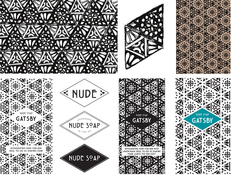
Fired up by began to doodle away but wasn't happy with anything until I searched through an old Art Nouveau pattern book and spotted a couple of unobtrusive triangles. They, to me, looked like a scientific equations but in pattern form, representing all the natural ingredients like plant extracts, oils etc that go into the making of soap. Taking the doodles I began to form the pattern, below are the initial concepts and scruffy doodles as I began to work with Jo on how we would take this to the next level and create her brand.
Stay tuned for the final reveal!

Sunday, July 22, 2012

Logo design

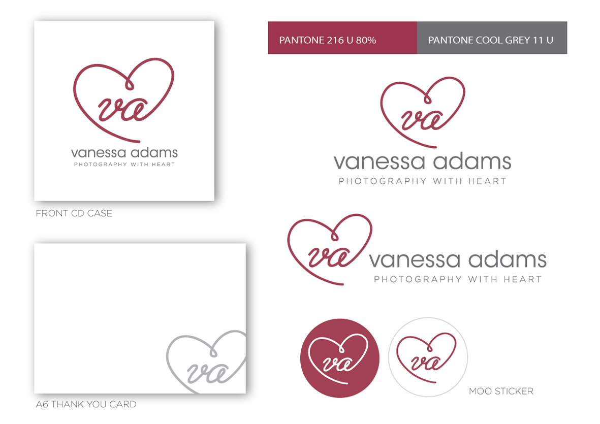
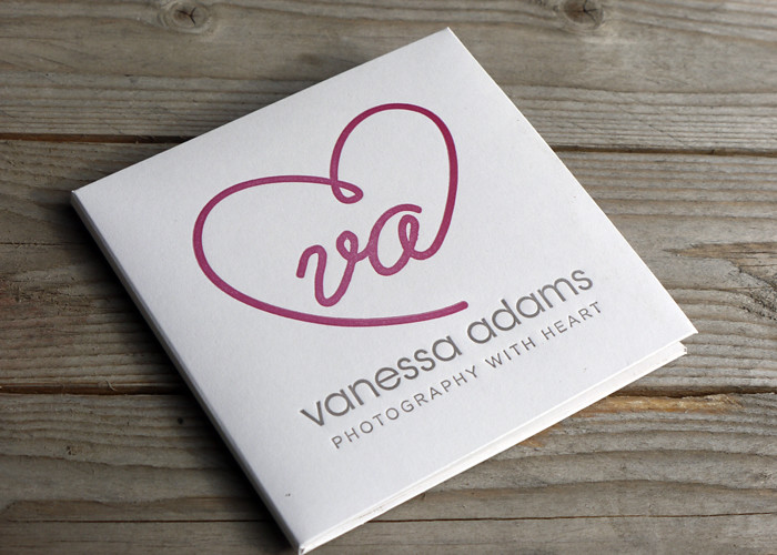
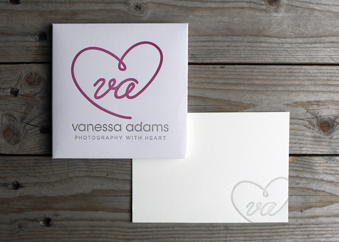
When Vanessa approached me to print her CD cases with her logo, it was crying out for a real identity! Many people are under the misconception that your name set in a typeface is a logo, when really a logo is an identifying symbol or mark that represents your brand. Vanessa is lovely and kindly trusted me with her re-brand. She wanted something simple and after reviewing her old blog and the way she shoots I came up with a new logo and a strapline. What's a strapline? In simple terms it's a short, catchy, easy to remember  phrase that represents your brand. It should encapsulate everything about you that will in turn strike a chord with your target audience. Can be used in conjunction with your logo or on it's own. Simple!
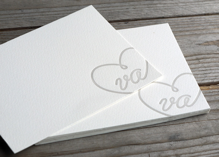
Above shows how adaptable the new design can be. The CD cases were printed letterpress with the website on the back and some thank you notes, which I love, in a paler version of the grey using just the logo bleeding off the edge. The logo worked perfectly for round MOO stickers to use on packaging, great way of getting your brand out there! As well as providing vector artwork for print, I also supplied Vanessa with web ready jpgs for her website and facebook cover plus a watermark brush for her photos. I think the black and white photographs work really well on website combined with the logo and Vanessa also got a logo guide with all the colour values converted for web, she has developed her site using just the two colours to keep her branding consistent.
Wow that's a long post for me! Hope you found it interesting? I just wanted to show that even on a budget a small business can look professional by getting their logo right at the first hurdle. As the company grows Vanessa can use the logo for other things, I think it would look fabulous as repeat pattern for her packaging, don't you? Her own branded tissue paper! Lovely!
Would also like to say a big thank you to Vanessa for visiting me at Saltair, she's so lovely and I think the design suits her to a T! Check out her website www.vaphotos.com.
UPDATE!
Check out Vanessa lovely pics sh took here on her blog, much better than mine ;) This is my favourite...


Related Posts with Thumbnails