Showing posts with label BESPOKE. Show all posts

Wednesday, May 21, 2014

recent work


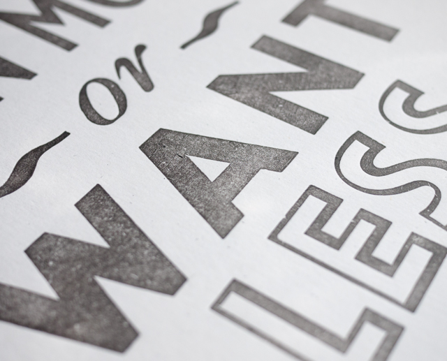
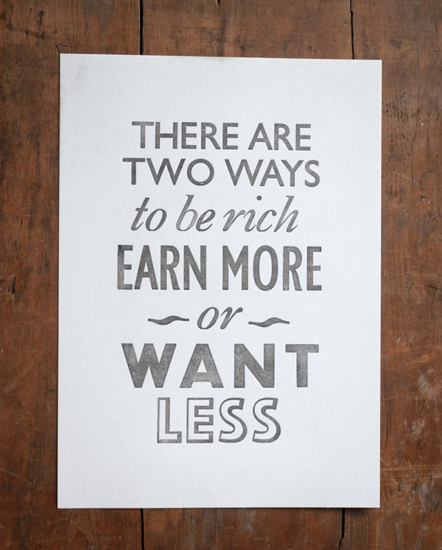
Sugden & Daughters as the name suggests is a family affair based in Northamptonshire. Owned by Mark & Louisa Sugden,  a husband and wife team; passionate about bringing beautiful, well crafted items into your home and garden. Louisa contacted me about designing and printing an exclusive letterpress print for their shop using this fabulous quote, one that encouraged them to set up their business so is close to S&D's hearts. Like me, they too are passionate about up-cycling, hand crafted items and have a love of old things that have a history and a story to tell.
It was a joy to work with them and I love how the print turned out, helps being on the same wavelength! Such a good quote to live by don't you think?
The print is available to buy exclusively at their Barn Shop and www.sugdenanddaughters.co.uk

If you would like to commission your own set of letterpress prints for your business, please contact me via www.printforloveofwood.com

Friday, August 31, 2012

Kraft pillow box packaging

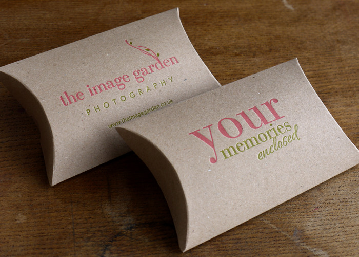
Kraft large pillowbox packaging for the lovely Sharron at The Image Garden. Sharron wanted a box that she could enclose a memory stick instead of a CD. I was a little worried about light pink and green on brown kraft but with a little touch of opaque white ink instead of transparent white they came out perfect!
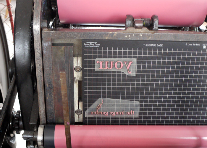
This was my first time printing with my new Chase Base with deep relief 1.52 plates from Lyme Bay Press. In reality you would print then die cut the shape but on short runs it more economically viable to print on pre cut boxes than have to pay for the cost of having a die cut made. The joy of letterpress, couldn’t do this with your modern printing methods! Though not being able to use registration marks can sometimes prove a pain the grid on the base made it simple, perfect registration and position!

Sunday, July 22, 2012

Logo design

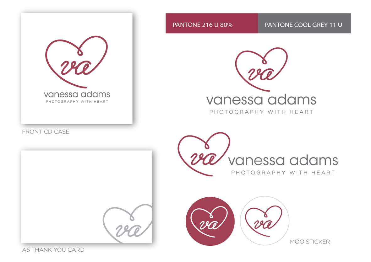
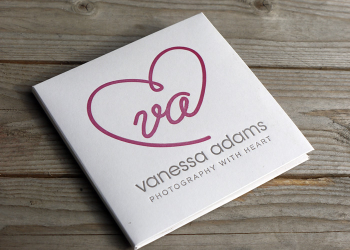
When Vanessa approached me to print her CD cases with her logo, it was crying out for a real identity! Many people are under the misconception that your name set in a typeface is a logo, when really a logo is an identifying symbol or mark that represents your brand. Vanessa is lovely and kindly trusted me with her re-brand. She wanted something simple and after reviewing her old blog and the way she shoots I came up with a new logo and a strapline. What's a strapline? In simple terms it's a short, catchy, easy to remember  phrase that represents your brand. It should encapsulate everything about you that will in turn strike a chord with your target audience. Can be used in conjunction with your logo or on it's own. Simple!
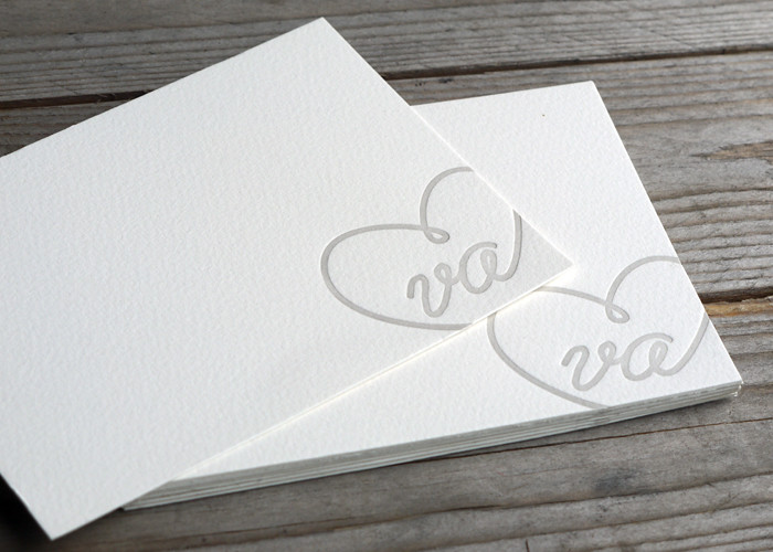
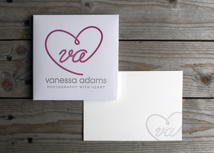
Above shows how adaptable the new design can be. The CD cases were printed letterpress with the website on the back and some thank you notes, which I love, in a paler version of the grey using just the logo bleeding off the edge. The logo worked perfectly for round MOO stickers to use on packaging, great way of getting your brand out there! As well as providing vector artwork for print, I also supplied Vanessa with web ready jpgs for her website and facebook cover plus a watermark brush for her photos. I think the black and white photographs work really well on website combined with the logo and Vanessa also got a logo guide with all the colour values converted for web, she has developed her site using just the two colours to keep her branding consistent.
Wow that's a long post for me! Hope you found it interesting? I just wanted to show that even on a budget a small business can look professional by getting their logo right at the first hurdle. As the company grows Vanessa can use the logo for other things, I think it would look fabulous as repeat pattern for her packaging, don't you? Her own branded tissue paper! Lovely!
Would also like to say a big thank you to Vanessa for visiting me at Saltair, she's so lovely and I think the design suits her to a T! Check out her website www.vaphotos.com.
UPDATE!
Check out Vanessa lovely pics sh took here on her blog, much better than mine ;) This is my favourite...

Thursday, July 19, 2012

letterpress business cards

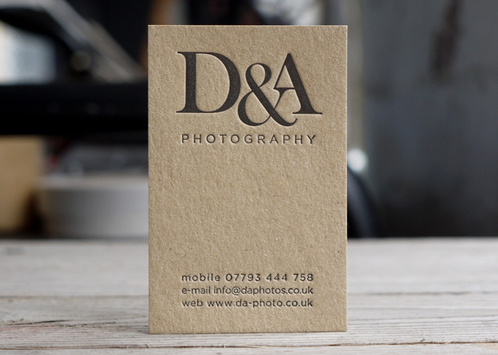
It was a pleasure to work with D&A on their business cards. Dan opted for the portrait layout which I'm so glad he did as it was my personal favourite. Symmetrical letterpress love, deeply impressed onto 500 micron kraft board.
D&A Photography is run by two enthusiastic, Fine Art Degree Graduates, Dan and Antonio, who both share a passion for arts and in particular weddings. Guys it was a pleasure!

Friday, December 23, 2011

Commissioned card

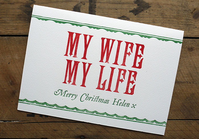
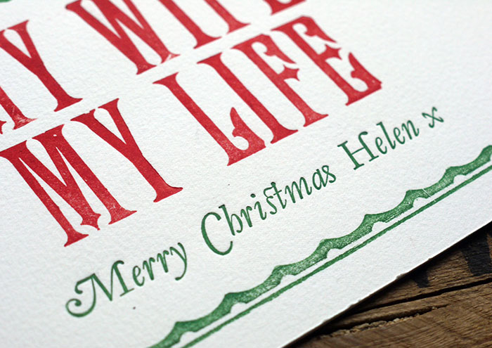
It's been a busy few months up to Christmas! Last job to be printed a last minute order for a bespoke Christmas Card, Victorian wood type accompanied by some hand set Garamond Italic, who can resist a lovely swash?
Related Posts with Thumbnails