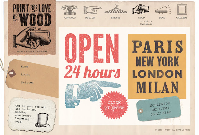
Designing your own website comes with the joys of never being happy with what you've done! Now on my seventh attempt of mocking up in Photoshop, it's been simple, more vintage and now meeting in the middle! I've learnt a lot along the way, no point designing something that isn't possible to to achieve in CSS! The logos I designed (see earlier post) need to change top left for each section and I've also been designing other possibilities that I can incorporate the new logos, more to follow...
Going to leave it to simmer on the back burner for a while while I get on with some stationery designs.
Would love to know what you think, do you think it reflects my ethos and my business? And any coding wizz kids out there can you spot potential problems?


wow-wee! it looks amazing!! x
ReplyDelete