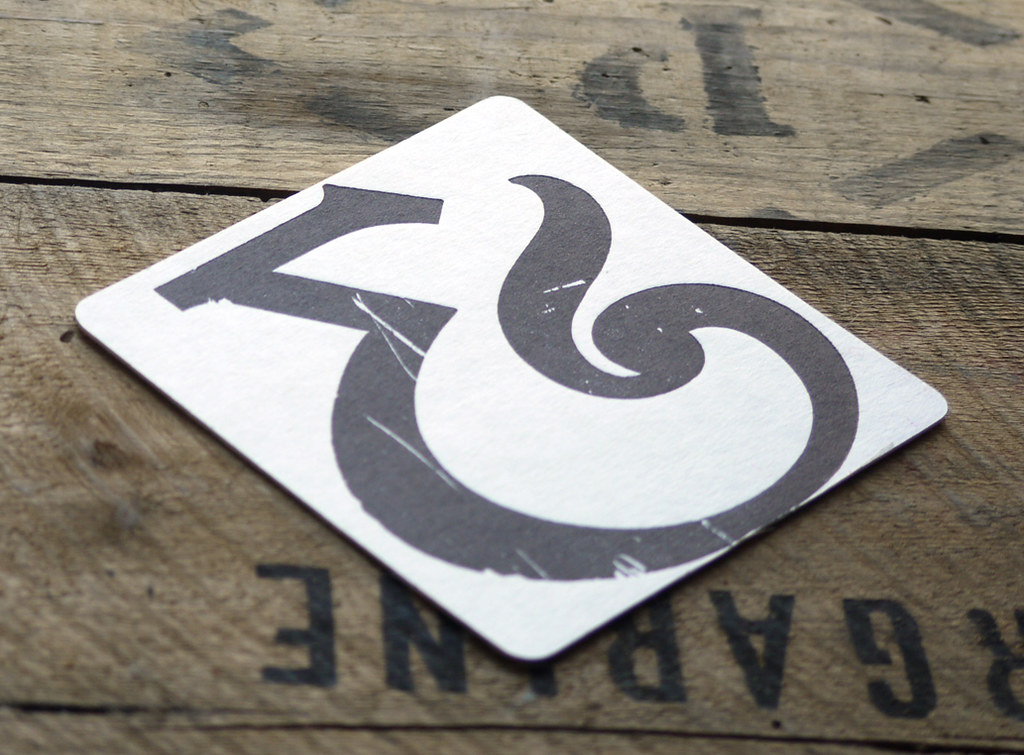


A beautiful wood ampersand from the 1930s complete with scratches and dents from it's war tone past, one of my favourite wood letters in my collection.
Printed on a victorian treadle press like the picture on the packaging, my first time on using this press and I love it, though standing on one leg and trying to get legs, arms and hands all working in unison took some getting use to! I didn't dare put any fast music on in case I treadled too fast and lost my fingers in the process, I tell you who needs a workout dvd when you have a 550lb treadle press, just a pity I can do it with my left leg as I loose all coordination ;o)
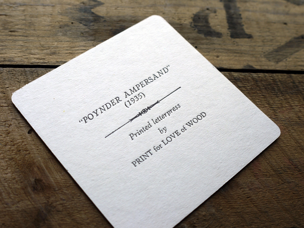
The back of the coaster features some hand set Verona type which has made a lovely impression in the thick, ink thirsty pulp board.
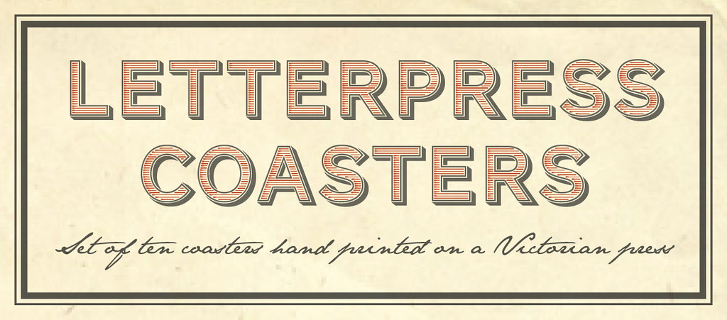
I used the free typeface family Conqueror for my packaging which I found on Font Squirrel and the script is Jane Austen which you download the improved version here. I designed the packaging about three times, went from tied up with string and a tag to my final design which I hope tells a story...
Any comments are greatly received!


jax, these look amazing! I love the packaging, the the branding, the scratchy ampersand, and especially the handset type. super job!
ReplyDeleteI LOVE them...
ReplyDeletegreat coasters & love the packaging too! xx
ReplyDeleteThese look fab!
ReplyDeletegorgeous :D xx
ReplyDeletelovely comments - thank you all, I lost my mojo for a little while, but it's back again ;o) Yeh!
ReplyDeleteI absolutely love the ampersand...! (isn't ampersand and odd word??)
ReplyDeleteYes it's a bit of a weird word -comes from the latin "per se" tocut a long story short ;D
ReplyDeletethank you Deborah and thanks for stopping by ;)