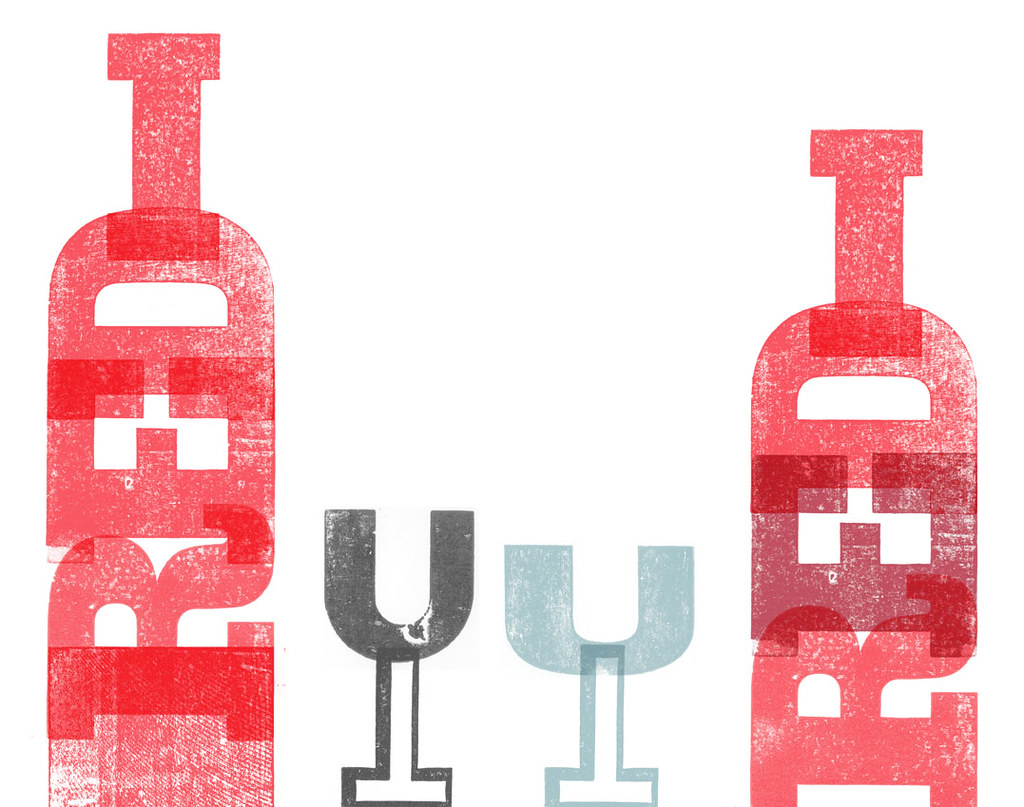
An idea I'm playing with for a book project for uni in which red wine and wood type are part of the text.
Can't decide which bottle I prefer... any thoughts?
Red wine is a favourite of mine for the weekend, especially if accompanied by a lovely meal ;) Hope everyone is having a lovely weekend!

I like the tall one...it seems more approachable ;-)
ReplyDeletei love the glasses. i like the red on the right, more fruity and fuller bodied i think. though the left is bigger and so contains more wine, which can only be a good thing;-)
ReplyDeleteThanks ladies!
ReplyDeleteI've just polished off the one on the left ;o)
I ilke the taller bottle and the taller wine glass. These are great, Jax!!
ReplyDeletefab designs! love the glasses & the bottle on the left ;0)
ReplyDeleteThanks for the comments, really appreciated, hard work when I keep looking at and have no one to ask ;)
ReplyDeleteLooks like it's the left then!
Really like the bottle and glass on the left - particularly like the wood crain showing through the block at the base of the bottle.
ReplyDeleteI love them both, but I think the taller one looks lovely at the bottom with the over lap on the R, fab!
ReplyDeleteI like the taller bottle and the glass... but I prefer the darker E in the shorter bottle as its adds a little more contrast to the solid red of the taller bottle.
ReplyDeletethan you, thank you!! ;o)
ReplyDeleteI'm so happy I can rely on my blogging friends to help me out!!
Taller one, as is, was my choice. Those glasses are great too! - PRY - prying1 -
ReplyDelete